Did you know that the way text is arranged on a map can dramatically affect how well people grasp the information it conveys?
Effective map typography isn’t just about making maps look good—it’s about enhancing communication and ensuring clarity.
I can confidently say that good typography can significantly boost user comprehension.
Map typography involves the careful design and placement of text on a map to support the symbols and features, making sure that the map is not only readable but also aesthetically pleasing.
In this article, we’ll explore what map typography is, why it matters, and how you can apply best practices to create maps that are both visually appealing and highly informative.
Let’s dive in!
Contents
- 1 What is Map Typography?
- 2 Functions of Map Typography
- 3 Factors to Consider
- 4 Examples of Effective Map Typography
- 5 Principles and Rules of Map Typography
- 6 Size Arrangement
- 7 Color in Typography
- 8 Best Practices for Designing Map Typography
- 9 Common Mistakes in Map Typography
- 10 Map Typography in 3D Maps
- 11 Conclusion
What is Map Typography?
Map typography is the craft of arranging text or letters on a map.
It’s about selecting, arranging, and positioning text optimally. This practice aligns with map typography principles, which encompass the style, arrangement, and appearance of text.
A general rule is that typography should extend from the symbol itself and should be ‘automatically’ connected to it in the reader’s mind, both in design and positioning: ‘good typography’ is barely noticed.
However, effective typography does much more. It enhances a map’s readability, guides users through the information, and can even evoke emotions related to the map’s content.
A related aspect of map typography is map labelling.
Map labeling involves describing, naming, and classifying objects or features on the map using attributes or information related to those objects. Text on a map often becomes a key part of the map, guiding users and establishing a visual hierarchy.
Overall, text and labels should be easy to read, easy to find, and easily associated with the objects they refer to.
Typography should show classification and hierarchy while interfering as little as possible with other map content.
The purpose of map typography is to add clarity. As a mapmaker, you should set aside any principle that reduces clarity and readability.
Based on my experience, text placement and map labels can also address map imbalances or draw attention to specific areas.
Map typography clarifies map reading and adds to the map’s aesthetics. Therefore, arranging text on the map, or typography, is crucial for the map to achieve its goal.

Functions of Map Typography
Text on a map explains information that other visual forms can’t easily convey.
It helps in the map reading process. However, if not arranged properly, this text can distract the reader and obscure the main information on the map.
In brief, the functions of map typography can be summarized as follows:
- Providing descriptions based on the attribute data of mapped objects.
- Writing names on the map or toponyms.
- Providing additional information to facilitate map reading.
- Serving as an alternative choice in map symbol design.

Providing Descriptions Based on Attribute Data of Mapped Objects
Map typography provides additional descriptions of the features or phenomena present on the map.
Maps use visual symbols by varying color, size, shape, texture, and others.
However, these symbols sometimes require text assistance as an additional description based on the object’s attributes to make the map easier to read or understand. This practice is known as map labeling.
Writing Names on the Map or Toponyms
Another benefit of map typography is writing toponyms or names on the map. For example, it’s used for writing the names of cities, rivers, or mountains.
Providing Additional Information to Facilitate Map Reading
Some maps require additional information in the form of text or narrative to help users read and understand the map. This information is usually displayed in the legend. However, it may also be included as text on the map’s face.
For example, see the image below. In that image, there is text on the map explaining…
Serving as an Alternative Choice in Map Symbol Design
Mapmakers sometimes choose labels as the only aspect in map symbolization. Here is an example where the mapmaker uses text as a variable in the symbol design.
Factors to Consider
Before doing map typography, it is important to consider the map’s purpose and what information the labels will display.
In my experience, understanding and concluding the hierarchy of features to be labeled and planning the visual hierarchy of the text itself is crucial. Users can then read, search, and infer the map’s meaning as efficiently as possible using the text on the map.
A good text hierarchy usually requires significant experimentation, revision, and repeated refinement.
Factors to consider when doing map typography include:
- Is it necessary to add toponyms, and which ones should be included?
- What layers need to be added with label information?
- Is additional information needed to facilitate map reading?
- How should the text be depicted or styled?

Should Toponyms Be Added, and Which Ones Should Be Displayed?
This question is answered by considering the map’s purpose and type.
For topographic or general-purpose maps, toponyms should be displayed as thoroughly as possible to facilitate easy reading. For thematic maps, toponyms may be minimal or even unnecessary.
Toponyms in thematic maps are needed to provide location context.
If the map’s location is already well understood by the reader, toponyms may not be required. For instance, a map showing internet usage by country across the globe typically does not need country names as labels.
Toponyms are essential for maps intended for audiences unfamiliar with the location context. An example is a study area map in a scientific paper, where the study area might not be widely known.
What Layers Need to Be Labeled?
Whenever possible, use visual variables to explain the phenomena being mapped. This avoids unnecessary duplication or the addition of symbols that make the map cluttered and harder to read.
However, there are times when labels are necessary, particularly for synthetic thematic maps that contain a lot of thematic information.
This type of map often includes multiple thematic layers, which may no longer be optimal if we have to force the use of map symbols. In such cases, labels can be used.
An example of label usage in maps is in geological maps.
In these maps, color variables show geological formations, and texture/patterns indicate rock types. With many point and line features present, geological formation labels are added to simplify map reading.
Additional Information to Simplify Map Reading
Next, determine whether the map requires text that explains additional information to assist with the map reading process.
For instance, this could be specific information about the location of money changer on a city tourism map. This additional information can be very helpful and should be included to ease the reading process.
How Should the Text Be Styled?
Text on maps has unique characteristics compared to, say, text in a book:
- Map text only displays words, not sentences.
- It often includes terms that might be unfamiliar to the general public.
- Text can vary in spacing.
- Text isn’t always horizontal; it can be vertical, slanted, or even shaped to match the object it represents (e.g., river names).
- Map text is usually placed against a specific line, background color, or pattern/texture.
These characteristics are closely tied to the requirement that map text must be easily identifiable and readable. This is especially critical when creating printed maps.
Examples of Effective Map Typography
Let’s look at some examples of maps that effectively use typography:
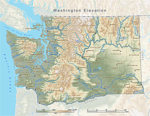
Text-on-point objects like city objects are placed near the object, usually on the right side, or placed slightly above/below.
In a map, the typography for rivers or other linear objects usually follows the line (even follows its curve), placed slightly above or below the line.
For area or polygon objects, you need to pay attention to the coverage and area of the polygon.
The existence of these boundaries and area sizes makes the choice of text placement more numerous. What needs to be noted is that the text must always be accurately read with the object it represents.
Principles and Rules of Map Typography
To do map typography effectively, follow these guidelines or principles:
- The text must show object hierarchy and be able to indicate which is more important and which is less important; it should also show the levels of toponyms (e.g., village-district-regency-province).
- The text must represent categorical differences (for nominal data).
- The text must always be readable as an explanation of the point, line, and area objects it represents.
To meet the hierarchy requirements, use these variables:
- Text size variation
- Text weight variation
- Letter spacing variation
- Color brightness variation
- Variation between capital and lowercase letters
Categorical differences can be created through:
- Text color variation
- Font style/shape variation
- Roman vs. italic variation
Font Arrangement and Style
Font selection is influenced by the map design style, the features or objects being labeled, the text’s function, and several other parameters.
Fonts are distinguished by their style, consisting of font characters along with their height, width, and intrinsic line thickness.
Font styles were once dominated by serif and sans serif. A serif is a small line used to finish the main stroke of a letter, while sans serif (meaning without serif) is cleaner as it lacks the serif.
In addition to serif and sans serif, there are also “decorative” and “script” fonts. Decorative fonts are artistic fonts with a specific style or shape that conveys a particular mood (e.g., Wild West). Script fonts are fonts that resemble cursive handwriting (e.g., Lucida Handwriting).
These types of fonts are rarely used on maps, especially official maps. However, you can use these fonts at certain times, such as when making maps for a game.

Bold and Italic Style Arrangement
The standard convention is that man-made features and place names are displayed in regular or upright text, while landforms, hydrographic features, and other natural environment features are displayed in italics.
However, with the possible exception of hydrographic text, this approach is less strictly adhered to. For hydrographic text, the text slope should follow the flow direction.
Uppercase, Sentence Case, Lowercase
In general, lowercase letters (without capitals) are rarely used in a map.
There are no strict rules regarding the use of capital letters on maps. Uppercase (all capital letters) is usually used for country, province, or city names. However, naming these objects can also be done using title case (capital letters at the beginning of words).
Sentence case is not used for names on maps (toponyms) because it does not align with toponymy rules. Sentence case is usually used to write labels related to object attributes or other additional information needed.
Size Arrangement
Text size is very effective for indicating visual hierarchy. Text size is usually expressed in point size (pt).
However, some things to consider are that each font may have different dimensions even if they have the same size (pt).
Conceptually, you can design that text object A will be larger than text object B. But for the exact size, you usually need to experiment to find the most optimal text size.
Spacing Arrangement
On maps, letter spacing or word spacing can be adjusted to improve readability or text size.
For example, in a long mountain range, you can use larger spacing so that the mountain name can be well-covered and represented by its label.
On the other hand, you can also narrow this spacing if needed. For example, so that your text or label can “fit” into a specific object.
Text Placement Arrangement
Text placement can adjust the position of labels relative to each other and form part of the overall map layout.
Well-placed text should clearly identify the objects or phenomena it refers to.
Based on my experience, optimal placement often requires some level of intervention by the cartographer or mapmaker, but this is often overlooked by beginners.
Text placement can be divided based on the objects it represents (point, line, area).

Point
Objects or information represented by a point are often labeled around that point.
In GIS practice, the position around the point is often given a preference ranking based on cartographic experience, with many placements favored above and to the right.
Line
For linear objects, labels are usually placed parallel to the object, or for rivers, they can be curved following their general shape.
Whenever possible, the text is better placed above rather than below the object. For example, street names. Labels placed above or below the line should not touch or cross the referenced object.
For long features, such as roads and rivers, labels should be repeated at reasonable intervals so that the feature is always identifiable by the reader.
For curved text, the writing direction should not be wrong, to avoid confusion. See the example below.
Label position is better placed at the center of the object, where there is enough space to be clearly read. Another part that can also be used is a horizontal line that is not curved.
Area
In general, area object labels are placed and spaced, and their size is adjusted to indicate the shape and area of the referenced object.
However, in some cases, stretching the label to cover the entire area of the object may not be a good idea. For example, because by doing so, the text will overlap or be too close to other texts.
To reduce this text “clutter,” the visual hierarchy principle can be applied. Thus, as a mapmaker, you should choose which texts are more relevant or important and display them based on the importance of the text or label.
Generally, area objects are labeled inside the polygon. However, there are some situations where it is better to place the label outside the polygon.
For example, the name of an island where the label can no longer fit within the island or where the label refers to a group of islands.
Besides the polygon’s shape and size, another factor that can make the label placed outside the polygon is the map’s scale and the number of labels that need to be displayed.
Orientation and Rotation Arrangement
Labels on maps can be rotated to achieve the best results. Rotation can be set by adjusting the angle clockwise from north.
Segmentation and Multi-Label Arrangement
In some situations, it may be best to split long names into two or more lines of text to utilize the available space or become a better or more appropriate representation of a particular area.
Alternative labels, or multilingual labels, or objects requiring more than one label can also result in text becoming two lines.
For multi-labels like this, you can use different arrangements, from font types, sizes, colors, or writing styles.
Use of Abbreviations
When there is not enough space for labels, it is possible to abbreviate as long as the map user can easily determine what each abbreviation means.
Besides methods for shortening text strings, cartographers use various standard abbreviations to describe features on the landscape with minimal disturbance, similar to the use of symbols.
Masking/Halo
Masking is a shape placed under the text but above part of the map to create a “text box” that makes the text easily seen and read.
Most GIS software uses shapes that adjust to the letters, covering the underlying map, usually in white, although other colors can be applied.
This color can also be given other effects, such as transparency or fade-out effects.
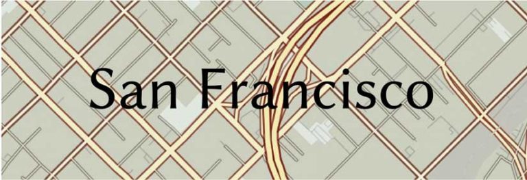
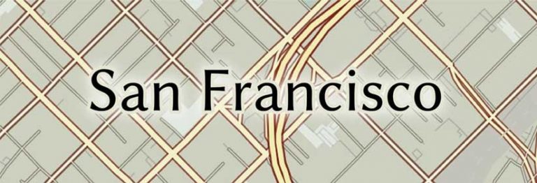
Here is how halo can enhance the readability of a label with a busy background.
Before:
After the halo is applied.
You can read about polishing a halo label here.
Callouts
Callouts on maps are text in boxes (which can also be other shapes, such as balloons), with lines indicating related features (leaders). Callouts are usually placed in areas with empty space or not much information.
This method is an effective way to label or annotate data without obscuring too many details.
Making callouts must be done carefully because too many callouts, especially with many leader lines, will confuse the map reader.
In interactive maps, the use of callouts is even more extensive, for example, to display long text or show images or photos. Usually, there are certain symbols or text that, when clicked or hovered over, will display the callout.
Color in Typography
Map typography generally uses black color to differentiate it from other colors, which are usually used for map objects.
Text color can also be chosen to help map readers associate it with certain objects, e.g., blue for water objects or green for vegetation objects.
But this color choice is not a strict rule.
Colored text will be more useful if applied to maps with simple colors. If the base map or thematic information uses many colors, using many colors in the text could be problematic.
To address this, masking or halo is commonly used.
Text color in map typography can be used to indicate categorical differences.
Using the same color with different shades (e.g., red gradient) can also indicate a visual hierarchy. However, using color to indicate visual hierarchy is more effective when used together with size differences.
Best Practices for Designing Map Typography
Creating effective map typography involves several best practices that can help you communicate your message more clearly:

- Choose the Right Font
- Sans-serif fonts are often preferred for digital maps due to their clean lines and readability.
- Avoid overly decorative fonts that can distract from the map’s purpose.
- Use Appropriate Sizes
- Ensure that important labels are large enough to be seen from a distance.
- Use smaller sizes for less critical information, but ensure they remain legible.
- Maintain Contrast
- Use high-contrast colors between text and background to enhance readability. For example, dark text on a light background or vice versa.
- Establish a Hierarchy
- Use different font sizes and weights to create a visual hierarchy. For instance, larger, bolder text for city names and smaller text for street names.
- Keep It Consistent
- Maintain consistency in font usage throughout the map to avoid confusion. Stick to a limited number of fonts and styles.
Common Mistakes in Map Typography
Even seasoned cartographers can make mistakes in typography. Here are some common pitfalls to avoid:
- Overcrowding: Too much text can clutter a map, making it difficult to read. Always prioritize clarity over quantity.
- Ignoring Scale: Text that looks good on a computer screen may not be legible when printed or viewed on a smaller device.
- Inconsistent Styles: Using too many different fonts or styles can confuse users. Stick to a cohesive design.
Map Typography in 3D Maps
With the development of map-making technology, a growing issue for cartographers is labeling in three dimensions (3D).
For this, labels are usually placed “floating” above features and facing the perspective or viewpoint.
The challenge in labeling 3D maps is that 3D maps are usually interactive maps where users can rotate the perspective, so the labels must also be adjusted to be dynamic labels.
Another challenge is related to lighting. Light and shadow are important aspects of 3D maps. Labels must also dynamically adjust to the direction of the light and shadow.
In 2.5D maps, labeling is easier because the perspective view never changes. In this type of map, text or typography arrangements can use the principles of 2D or flat maps.
Conclusion
This article has explained map typography, including its definition and functions or benefits. In addition, this article also discusses guidelines or tips for map typography, along with examples.
Map typography and lettering are vital aspects of cartography that can significantly enhance the effectiveness of your maps. By understanding their importance and applying best practices, you can create maps that are not only visually appealing but also highly functional.
I encourage you to experiment with typography in your own mapping projects.
Pay attention to how different fonts, sizes, and colors impact readability and user experience.
Based on my experience, doing so can greatly enhance the clarity and effectiveness of your maps.
If you have any tips or experiences to share, feel free to leave a comment below! Hopefully, this article is helpful.