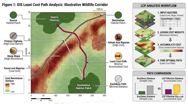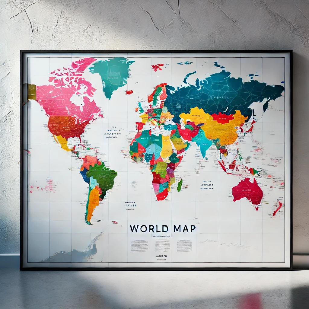
Maps are indispensable tools for understanding and communicating spatial information.
To create a map, cartographers must carefully select and integrate various elements that help the reader interpret and understand the information presented. These map elements may include the title, legend, scale, symbols, and grid lines, among others.
In this article, we’ll explore the key map elements, their purposes, and their importance. We’ll also discuss how to use them effectively to create clear and accurate maps.
Let’s dive in!
Contents
- 1 What Are Map Elements?
- 1.1 1. Map Title
- 1.2 2. Subtitle
- 1.3 3. Map Area
- 1.4 4. Map Legend
- 1.5 5. Map Scale Indicator
- 1.6 6. North Arrow
- 1.7 7. Inset Map
- 1.8 8. Map Lettering
- 1.9 9. Map Projection and Coordinate System
- 1.10 10. Grid Lines
- 1.11 11. Data Sources and Citation
- 1.12 12. Production Year
- 1.13 13. Mapmaker’s Information
- 1.14 14. Border Lines
- 1.15 15. Element Border
- 1.16 16. Map Sheet Number
- 1.17 17. Images
- 1.18 20. Tables
- 1.19 21. Descriptive Text
- 1.20 Acknowledgment
- 1.21 Is It Necessary to Display All Map Elements?
- 1.22 Wrap Up
What Are Map Elements?
Map elements are components on a map that assist the reader in interpreting and understanding it more easily.
Understanding these elements is crucial for both map readers and mapmakers. Each element serves a specific function, with the primary goal being to help the reader grasp the map’s content more effectively.
If you want to know how to design and arrange these elements to make your make your map beautiful yet accurate, I suggest you read this first:
Now, without further ado, let’s dive into some of the essential map elements.
1. Map Title
The first element of a map is the title, which provides information about what the map represents.
The title is critical because it’s the first thing the reader notices. It should describe the map’s content and type, and it may also include the geographical location and the institution that created it.
However, on thematic maps or maps used for presentations or scientific papers, the geographical location might not be necessary.
For instance, instead of a title like “Distribution of Deforestation in Indonesia from 2000-2020,” you could use something more engaging like “Where Deforestation Has Occurred in the Last 20 Years.”
Even in some cases, the map title might be omitted altogether and replaced with a title in the legend.
Map titles are typically capitalized and presented in a large font size to catch the reader’s attention.
The title should be placed prominently but should not distract from the main content of the map.
2. Subtitle
Subtitles or subheadings are not always necessary on a map, but they can be useful for adding extra information to the map title, especially if the title is lengthy.
Subheadings might include details such as the period or analysis methods used. For example:
- Title: WHERE DOES DEFORESTATION OCCUR?
- Subtitle: REMOTE SENSING DATA ANALYSIS 2000-2020
Subheadings are placed just below the map title, using the same typography but in a smaller font size to ensure the map title remains the main focus.
3. Map Area
The map area, or main map body, is where the primary information or “image” is displayed. Some refer to this as the data area or data frame.
This is the most important thing to note: The map area should always be the focal point for the reader.
When designing map layouts, it’s important to consider how many maps will be included.
Maps with more than one map area require additional consideration, such as determining whether the map is multi-temporal or multi-themed.
For multi-temporal maps, a single legend may suffice, with each map area showing the distribution of phenomena over different periods.
For multi-themed maps, each map area might require its own legend. Careful layout planning is crucial to avoid confusion.
Ideally, the main information should be in the primary map, with supplementary information presented as a map inset.
4. Map Legend
A map legend is an essential map element that almost always appears.
It explains the symbols (icons, points, lines, polygons) and their descriptions (item labels) used on the map.
The design of the legend should be tailored to the map’s intended audience and format.
Sometimes, mapmakers exclude commonly understood features with standard symbols, such as regional boundaries, water bodies, or elevation.
If you create a map for presentation purposes, the legend should be minimal to keep the focus on the speaker, yet clear enough to be understood when the slides are viewed later.
The legend should be located near the map area it corresponds to, either inside or outside the map area.
On maps with multiple map areas, such as multi-temporal maps, a single legend may suffice.
In atlases or reports where the same legend is reused, it might only appear on the first map, but it should remain easily accessible for the reader when needed.
5. Map Scale Indicator
The scale of a map is the ratio of distance on the map to the actual distance on the ground. There are several ways to represent map scales, including numeric, graphical, and verbal formats.
Modern maps often forgo verbal scales, while official government maps typically include both numeric and graphic scales.
With the rise of digital maps, the use of numeric scales is declining since maps can be easily zoomed and resized.
However, the graphic scale remains useful because it adapts to changes and still provides a scale illustration, even if the map isn’t intended for precise measurements.
A simple graphical scale might use segments of a line with distance markers.
6. North Arrow
The orientation indicator, commonly known as the north arrow, is a graphic element that points toward the north.
It is often omitted because the north is typically assumed to be at the top of the map.
However, in cases such as navigation maps or topographic maps, where both true north and magnetic north are important, including a north arrow is recommended.
It should be depicted with four or eight cardinal directions for navigation purposes.
On maps where the north direction does not align with the top of the map, the north arrow should be oriented accordingly to prevent confusion.
7. Inset Map
An inset is a smaller map included within the borders of a larger map, providing additional information.
A map inset can:
- Show a portion of the main map in more detail by zooming in on a specific area.
- Provide context by zooming out to show the surrounding area.
- Offer additional thematic information that aids in interpreting the main map.
- Connect different map locations that share similar information on the same map sheet.
Overall, insets are valuable map element for supplying supplementary information and context to the main map.
8. Map Lettering
Map lettering refers to the placement of text or labels on a map.
This text conveys information that cannot be easily represented visually and helps facilitate map reading.
However, if map lettering is not arranged properly, it can distract or confuse the reader and obscure the map’s main content.
If you’re interested in learning more about map lettering, including its purpose and guidelines, consider reading the article “What is Map Typography? Unlock the Secrets of Effective Map Labeling for Stunning Visuals“
9. Map Projection and Coordinate System
Before proceeding, it’s advisable to read an article on map projection to better understand this topic.
One reason for including projection information on a map is to remind the reader of the potential advantages and limitations of the map they are using.
For example, understanding the map projection system can help determine if the map is suitable for measuring distances or areas, navigation, or other purposes.
10. Grid Lines
Map grid lines are lines that run along the surface of a map.
It allows the mapmaker to pinpoint the location of any point based on latitude and longitude or metric coordinate systems.
These lines are beneficial on general-purpose maps or maps used for navigation.
Maps designed to present analytical information may omit grid lines.
Instead, include coordinate points at the map’s edges or use a plus sign at the intersection of two coordinate lines to provide a sense of location without showing actual lines.
11. Data Sources and Citation
The map source element indicates where the data used to create the map originates.
It often includes citations and references to the authorized agencies or data providers involved.
This information is crucial for providing the reliability and trustworthiness of the map.
12. Production Year
Including the production year on a map helps the reader understand how the information might have changed over time.
It also provides insight into the accuracy of the data at the time it was created, aiding in evaluating the map’s reliability and identifying any potential changes that may have occurred since.
13. Mapmaker’s Information
This map element refers to the individuals or organizations responsible for designing, analyzing, and compiling the map.
Including the mapmaker’s name is important for several reasons: it signifies accountability, provides a contact for follow-up questions, and gives credit for the work.
By including this information, the mapmaker ensures accountability, offers a point of contact for inquiries, and acknowledges the effort involved in creating the map.
14. Border Lines
The map’s borderline groups all the elements of the map layout by enclosing them within a single line.
The border line can be thicker than other lines on the map, but this isn’t always the case.
Additionally, the border not only acts as a frame but also serves as a visual boundary if the map has a background color, making it easier to distinguish the map from other information on the page.
15. Element Border
The boundary line of a map element is usually a box that separates different map components.
The purpose of this line is to give the map an organized appearance by clearly separating its elements.
Element borders are almost always black or dark gray, but they aren’t always present.
When they are included, they should be designed effectively and aesthetically.
16. Map Sheet Number
A map sheet number refers to the identifying number of a specific map within a series.
This number is typically accompanied by an indication of the total number of maps in the series, a common feature on government-issued maps.
When a map is part of a series, it’s important to include this information. Given its significance, the map sheet number is usually placed directly after the title.
17. Images
Photographs and images on a map provide visual representations of the mapped objects or related features. It helps the map reader better understand what is being depicted.
Common types of images used in map layouts include:
- Photos of the mapped objects, like a species or a representative image of a habitat type.
- Images of the sampling or data collection process.
- Photos of the tools used for sampling or data collection.
In some cases, these images can be linked to a specific location on the map using coordinates and placed near the corresponding location using callouts.
It’s crucial to ensure that these images don’t distract from the map’s focus and should only be added if they serve a specific purpose.
The selection of photos and images must be precise and effective, ensuring clarity and immediate comprehension.
18. Graphs and Diagrams
Graphs and diagrams can add valuable context and information to a map.
For instance, a graph showing population by age group can help analyze and interpret a population density map.
However, the inclusion of these elements should be based on the map’s purpose.
Graphs and diagrams should match the colors and shades used on the map if they represent the same data.
The chosen graph type should depict the data as simply as possible, and if necessary, include a text box or arrow explaining its significance to the map reader.
19. Institution Logo
Sometimes, the logo of the institution that created the map is included within the map itself.
While the logo is not directly related to the map’s content, it can be helpful to include it in certain contexts.
The logo is often placed near the title so that readers can quickly identify the institution responsible for the map.
This can be particularly useful for official maps, such as evacuation maps, where it’s important for readers to immediately recognize the institution behind the information.
However, in many cases, it may be more appropriate to place the logo alongside the mapmaker’s information. This decision ultimately depends on the map’s context and purpose.
20. Tables
A table is a collection of data arranged in rows and columns, typically with column headers.
While maps are effective for showing patterns, distributions, and spatial trends, a map reader may sometimes require more detailed statistics about the mapped objects or phenomena.
When this information cannot be effectively conveyed through map symbols, a table may be the best choice.
21. Descriptive Text
Descriptive text in the context of a map element refers to any additional text that supports the purpose of a map but doesn’t fit into the categories mentioned above.
Sometimes, specific information required to understand the map may need unique descriptive elements.
This text-based information is often extensive, so it’s important to present it in a way that is legible but does not interfere with the overall presentation of the map.
Examples of descriptive text include:
- Disclaimers
- Copyright information
- Certifications
- Acknowledgments
- Analysis methods or data used
This information is usually placed on the map’s margin or in a separate part of the document to avoid disrupting the map’s readability.
Disclaimer
A disclaimer is a statement used by most public institutions and many private companies to protect against legal action that might arise from the use of maps for unintended or inappropriate purposes.
Disclaimers can also inform readers of any limitations in the map products.
An example of a disclaimer might be: “This data is provided as is. The user is responsible for determining the appropriate use of the data; the agency is not responsible for any negative consequences that may result from its use.”
Another example could be: “This map is for reference only. Do not use it for field measurements.”
It’s important to present disclaimers clearly and legibly, often in small but readable text on the map layout, alongside other elements in a way that doesn’t disrupt the map’s readability.
Copyright Information
Copyright refers to the legal protection of a creative work and its authorship.
This information is essential for crediting the map’s creator and indicating when it was made.
Many mapmakers now choose to license their work through Creative Commons or similar licenses, allowing them to share and distribute their work while retaining certain rights.
Including a copyright statement differs from having the work copyrighted; the latter involves registration, while the former is always required.
In the map layout, copyright information should be clear and easy to read, usually in small but legible text, alongside other elements in a way that doesn’t disrupt the map’s readability.
Analysis Method and Additional Information
Analysis methods can be briefly discussed to provide additional context during the map’s analysis and interpretation process.
These methods don’t need to be detailed but should be communicated clearly.
This type of text now can be easily found on modern maps. Many mapmakers display maps as infographics that can be easily shared through social media.
Here are some examples where the text becomes an integral part of the map.
Acknowledgment
If necessary, acknowledgment can be included on the map. This section allows the mapmaker to express appreciation to those who assisted in the map’s creation.
Is It Necessary to Display All Map Elements?
It’s not always necessary to include all elements in a map. Most of the time, you just need some of them. Literally.
The map’s purpose, target audience, and medium are some factors that we consider when we select the map element to be displayed.
For example, when creating a map of a research study area, such as Jakarta, which will be printed and published in an international journal, the most important aspect might be location.
In this case, map titles, data sources, and information about coordinate systems or projections might not be necessary.
To help readers better understand the location’s context, several levels of map insets can be used, starting with the State of Indonesia, followed by Java Island, and finally the main map of Jakarta.
This approach can be applied to any map. The key is to include only the elements essential for the reader to understand the map and to keep the information minimal.
Wrap Up
In this article, we’ve explored the various elements that make up a map, including their explanations, considerations for their use, and a brief guide on how to select styles and incorporate them into map layouts.
Understanding these elements is essential for effective map-making and interpretation.
Not all map elements need to be displayed on every map, and the most important thing is to include only the elements that are essential for the reader to understand the map.
By considering the map’s purpose, target audience, and medium, we can create clear and effective maps that communicate the intended information.
We hope this blog post has provided you with a better understanding of map elements and how to use them effectively in your work.
If you have any comments or tips regarding selecting and placing these elements into a map, please do share them with us and others!
Happy mapping!