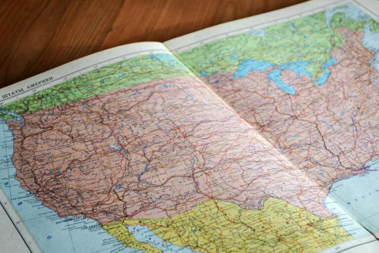
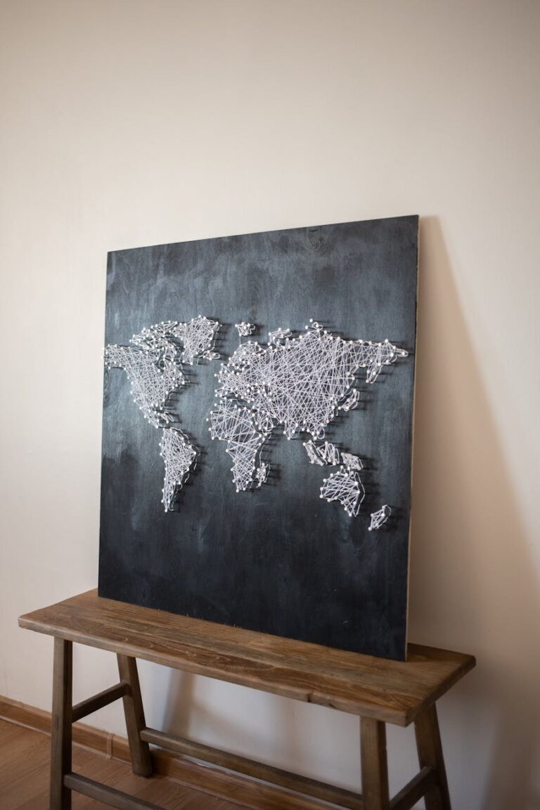
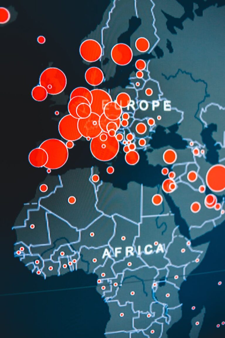
As a part of an artwork, the appearance of a map holds significant importance. A well-crafted map doesn’t just show data—it grabs your attention and invites you to explore. This ensures that the primary objective—delivering spatially referenced information—is effectively achieved.
In this post, we’ll explore the concept of map layout. We’ll discuss the different types of map layouts, such as frame maps, island maps, and bleeding edge maps.
We’ll also cover how each layout can enhance both the visual appeal and functionality of a map.
Whether you’re a beginner or a seasoned cartographer, understanding map layouts is key to creating maps that communicate information clearly and effectively.
Contents
What is Map Layout?
A map layout refers to the arrangement of the map’s content along with other cartographic elements.
These elements—things like the title, scale, legend, and location markers—need to be placed just right.
The placement of these elements and the map’s content should consider both aesthetic factors and ease of understanding for the reader.
Within Geographic Information Systems (GIS), the map layout process is the final stage. After inputting, analyzing, and visualizing spatial data, you pull it all together in the layout to make the map sing.
This is done because most users require ready-to-use map outputs, whether in hardcopy or softcopy formats, such as JPG or PDF.
Importance of Map Layout
Imagine reading a book with all the text jumbled together—no chapters, no headings, just one big block of text. It would be a nightmare, right?
The same thing happens with maps.
Without a thoughtful layout, even the most detailed and accurate map can become confusing and hard to interpret.
A well-designed layout guides the viewer’s eye, helping them naturally absorb and understand the spatial story you’re telling.
Function of Map Layout
The function of a map layout is to facilitate map reading by making the map easy to read and adding information through essential components.
When your layout is spot-on, it leads the reader’s eye right where you want it to go, making the map easy to navigate and understand.
Components of a Map Layout
A good map layout is composed of several key components, each playing a critical role in ensuring the map’s effectiveness and readability.
These are the essential elements to consider when designing a map layout:
1. Title
The title of a map is its first impression. It should shout out what the map is about, loud and clear.
It’s like the headline of an article—if it doesn’t grab attention or make the topic obvious, people might just skip over it.
- Be Specific: “Population Distribution in Europe, 2023” is more informative than just “Population Map.”
- Keep it Short: Aim for 5-10 words.
- Make it Relevant: The title should reflect the map’s content accurately.
2. Map Body (Main Map Area)
The map body is the star of the show—the main area where the geographic data is displayed. This is where the magic happens. Your data turns into a visual story here.
- Focus on the Most Important Data: Don’t overcrowd the map. Highlight the area that’s most relevant to your map’s purpose.
- Use Inset Maps if Necessary: If your map covers a large area but you want to highlight a smaller region, an inset map can be a great tool.
3. Legend
The legend is like a decoder ring for your map. It explains the symbols, colors, and patterns used, making it easier for viewers to understand what they’re looking at.
- Keep It Simple: Only include what’s necessary.
- Be Consistent: Use the same colors and symbols throughout the map.
- Position Wisely: Place the legend in an area where it’s easily seen but doesn’t obstruct important map details.
4. Scale
The scale tells the viewer how map distances relate to real-world distances. There are several types of scales you can use:
- Graphical Scale: A visual bar that represents distance.
- Verbal Scale: A statement like “1 inch equals 1 mile.”
- Representative Fraction (RF): A ratio, such as 1:50,000.
How to Choose and Display the Appropriate Scale:
- Match the Map’s Purpose: A detailed city map might use a large scale (1:10,000), while a country map might use a smaller scale (1:1,000,000).
- Place it Near the Legend: This is often the most logical spot for the scale bar.
5. North Arrow
A north arrow helps viewers orient themselves, showing which direction is north on the map. It’s a small but crucial element, especially if the map isn’t aligned with true north.
- Keep It Subtle: It shouldn’t distract from the map’s main content.
- Position Strategically: Usually in a corner, but ensure it’s not obstructing important details.
6. Graticule/Grid
Graticules (latitude and longitude lines) or grids (based on a coordinate system) help in locating positions and measuring distances on a map.
- Provides a Reference System: Graticules help users pinpoint exact locations.
- Aids in Distance Measurement: Grids can be used to calculate distances between points on the map.
7. Insets
Inset maps are like the zoom feature on your camera—they show a smaller area in greater detail or provide a broader context for the main map area.
- Use Insets to Highlight Important Areas: Focus on regions that need more detail or context.
- Position Thoughtfully: Place the inset map near the area it relates to, without obstructing the main map.
8. Labels and Annotations
Labels identify key features on your map, making it easier for viewers to understand what they’re looking at.
- Avoid Overcrowding: Don’t place too many labels close together.
- Use Contrasting Colors: Labels should stand out against the map background.
- Choose a Readable Font: Stick to simple, sans-serif fonts for clarity.
9. Data Source and Credits
Crediting your data sources isn’t just a courtesy—it’s a necessity. It adds credibility to your map and allows others to verify or explore your data further.
- Be Transparent: Clearly state where your data came from.
- Place Wisely: Credits often go in the lower-left or lower-right corner of the map.
10. Border and Neatlines
Borders and neatlines frame your map, giving it a finished look and helping to focus the viewer’s attention.
- Create a Visual Boundary: Neatlines separate the map content from the surrounding page.
- Keep It Simple: The border should enhance, not overpower, the map’s design.
11. Other components
There are many more map components that we don’t cover in this article. Please go to this article to get more detailed explanation: What Are Map Elements? 20+ Essential Map Elements You Need To Know
Types of Map Layouts
There are three primary types of map layouts:
- Frame Map
- Island Map
- Bleeding Edge Map
Frame Map
This layout type features an outer border that surrounds the map’s face.
The border clearly separates the map’s main content from any marginal information. It provides a clean and organized appearance.
This traditional layout is commonly used in formal and official maps where clarity and structure are paramount.
Example of a Frame Map Layout:

Island Map
A more conventional layout than the frame map is the island map.
In this layout, the boundary of the mapped area itself serves as the frame, offering greater design flexibility.
This type of layout is particularly useful for highlighting specific areas of interest. It allows the mapmaker to adapt the layout to the shape of the study area.
Example of an Island Map Layout:

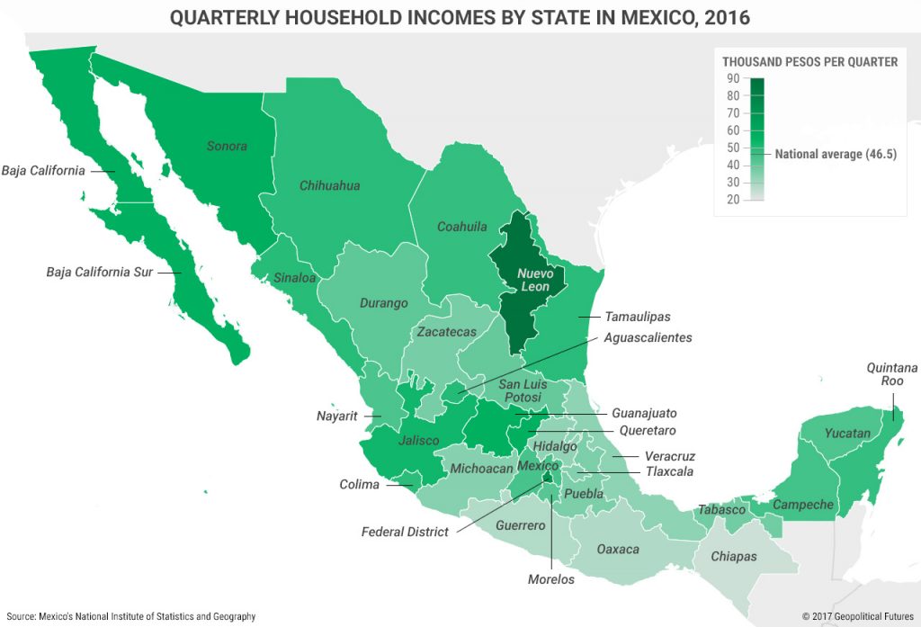
Bleeding Edge Map
In a bleeding edge map layout, the content extends all the way to the edge of the map.
This eliminates the traditional border. It creates a modern and dynamic visual effect.
This layout is often used in thematic or artistic maps where a full-page visual impact is desired.
Example of a Bleeding Edge Map Layout:
Single vs. Multiple Map Layout
A single map layout focuses on one area or topic. This makes it ideal for detailed analysis or clear, focused presentations.
- Highlight the Focal Point: Ensure that the main area of interest is clearly visible and easy to understand.
- Keep Supporting Elements Simple: Don’t overcrowd the map with too much extra information.
A multiple map layout, on the other hand, is useful when you need to compare different datasets or show changes over time. They allow you to present multiple perspectives within a single layout.
- Use a Grid Layout: Align maps in a grid to keep them organized.
- Ensure Consistent Scale and Symbology: This makes comparisons easier for the viewer.
Principles of Effective Map Layout Design
A well-designed map layout doesn’t just happen by accident—it’s the result of applying key principles of design that ensure the map is both functional and visually appealing.
Here are some of the principles that you can use:
1. Visual Hierarchy
Visual hierarchy refers to the arrangement of elements on your map in a way that guides the viewer’s eye to the most important information first.
- Size: Larger elements catch the eye first.
- Color: Bright or contrasting colors stand out more.
- Positioning: Place the most important elements in prominent positions (e.g., the center or top).
2. Balance and Alignment
Balance in map design means distributing elements evenly so that no part of the map feels too heavy or too light.
- Symmetrical Layouts: Keep elements aligned to a central axis for a balanced look.
- Use Grid Lines: Grid lines can help ensure everything is perfectly aligned.
3. Contrast and Color
Contrast helps to distinguish different elements on your map, making it easier to read and interpret.
- Stick to a Limited Palette: Too many colors can confuse the viewer.
- Use Contrasting Colors: Make sure adjacent elements contrast enough to be distinguishable.
4. Consistency
Consistency ensures that your map is easy to understand and navigate. It also gives your map a professional, cohesive look.
- Use the Same Symbols and Colors: Across different maps or within a single map, stick to a consistent set of symbols and colors.
- Standardize Fonts and Sizes: This makes your maps look polished and professional.
5. Simplicity and Clarity
Less is more when it comes to map design. Simplicity helps prevent clutter and ensures that your map’s message is clear.
- Remove Unnecessary Details: Only include elements that add value to the map.
- Use White Space: Don’t be afraid of empty space—it can help separate and highlight important information.
Map Layout Guidelines
Creating a map layout can be tricky, but with some key guidelines, you can streamline the process and avoid common pitfalls. Here are some tried-and-true tips to keep your map layouts sharp and effective:

Follow Established Standards
Whenever possible, adhere to existing guidelines or standards relevant to your map type or industry. This ensures consistency and can save you time by providing a clear framework to work within.
Keep the Purpose of the Map in Focus
Always design with the end goal in mind. Whether the map is for academic use, public display, or a private project, the layout should support the map’s purpose and audience.
Know Your Audience
Understanding who will use your map can significantly influence your design choices. Tailor the layout to the knowledge level and needs of your audience. Whether they’re professionals, students, or the general public.
Match the Medium
Different media require different layout considerations. A map intended for print might have different requirements than one intended for a digital platform. Ensure your design works well in the medium it’s meant for.
Double-Check Symbols and Labels
Errors in symbols and labels can undermine your map’s credibility and usefulness. Always verify that these elements are correct and legible before finalizing your layout.
Design with Attention Flow in Mind
The layout should guide the viewer’s eye naturally through the map, ensuring that they notice and interpret the most critical information first. Use visual hierarchy and thoughtful placement to achieve this.
Common Pitfalls in Map Layout Design
Even seasoned cartographers can fall into common traps when it comes to map layout design. Here are some pitfalls to watch out for, along with tips on how to avoid them:
Overcrowding the Map
One of the most frequent mistakes is trying to cram too much information into a single map. This can overwhelm the viewer and make the map difficult to read. Prioritize information and use inset maps or multiple layouts to cover additional details.
Inconsistent Design Elements
Inconsistency in symbols, colors, fonts, or other design elements can confuse viewers and detract from the map’s professionalism. Standardize elements and create a style guide if you’re creating multiple maps.
Poor Color Choices
Using too many colors or colors that don’t contrast well can make your map hard to read. Stick to a limited color palette and test colors in print if your map is going to be printed.
Neglecting the Audience’s Needs
Design your map layout with your audience in mind. Tailor the complexity and detail level to their knowledge and needs, and seek feedback from a sample of your audience to ensure it meets their needs.
Ignoring the Medium
Design your map for the medium in which it will be displayed. A map designed for a digital screen may not work well in print, and vice versa. Always test your map in its final format before distributing it.
Conclusion
Through this article, we have explored the importance of map layout in creating effective and visually appealing maps.
We covered the definition, purpose, and various types of map layouts, along with tips for designing layouts that adhere to cartographic principles.
We also touched on the common pitfalls in map layout design. This ensures that you can avoid these mistakes in your future projects.
Remember, the layout of a map can significantly impact how easily the information is understood by its users.
By carefully considering the purpose of the map, its intended audience, and the medium in which it will be presented, you can create layouts that not only look great but also convey spatial information accurately and efficiently.
If you have any questions about map layout or if you’d like to share your own tips and experiences, please feel free to leave a comment below.
I’m always eager to discuss and learn more about the art and science of cartography.
Happy mapping!