Did you know that the way symbols are presented on a map can make or break how easily you interpret the data?
Map symbolization isn’t just about making a map look good .
It’s about transforming complex geographic information into clear, understandable visuals.
From choosing the right colors to deciding the size of symbols, each decision plays a crucial role in how you perceive and use the map.
Map symbolization is the process of using visual elements like points, lines, and areas to represent geographic data on a map. It helps convey complex information clearly by assigning symbols to features such as roads, rivers, and regions.
Effective map symbolization ensures users can easily interpret trends and patterns in the data, making it an essential tool in cartography.
In this article, you’ll dive into what map symbolization is, why it’s essential, and how mastering it can enhance your ability to create and interpret maps effectively.
Let’s explore the art and science behind map symbols and see how it all comes together.
Contents
- 1 What is Map Symbolization?
- 2 Understanding Basic Concepts of Map Symbolization
- 3 Visual Variables
- 4 Design Principles for Map Symbolization
- 5 Symbolization Techniques
- 6 Tips and Tricks in Designing Map Symbols
- 7 Challenges in Map Symbolization
- 8 Symbolization in Thematic Mapping
- 9 Future Trends in Map Symbolization
- 10 Wrap Up
- 11 FAQ
- 11.0.1 What is map symbolization in simple terms?
- 11.0.2 What is the difference between map symbols and map symbolization?
- 11.0.3 What are the six visual variables in map symbolization?
- 11.0.4 How do I design maps that are accessible to colorblind users?
- 11.0.5 What is a choropleth map and when should I use it?
- 11.0.6 How is AI changing map symbolization?
- 12 Join the Community
What is Map Symbolization?
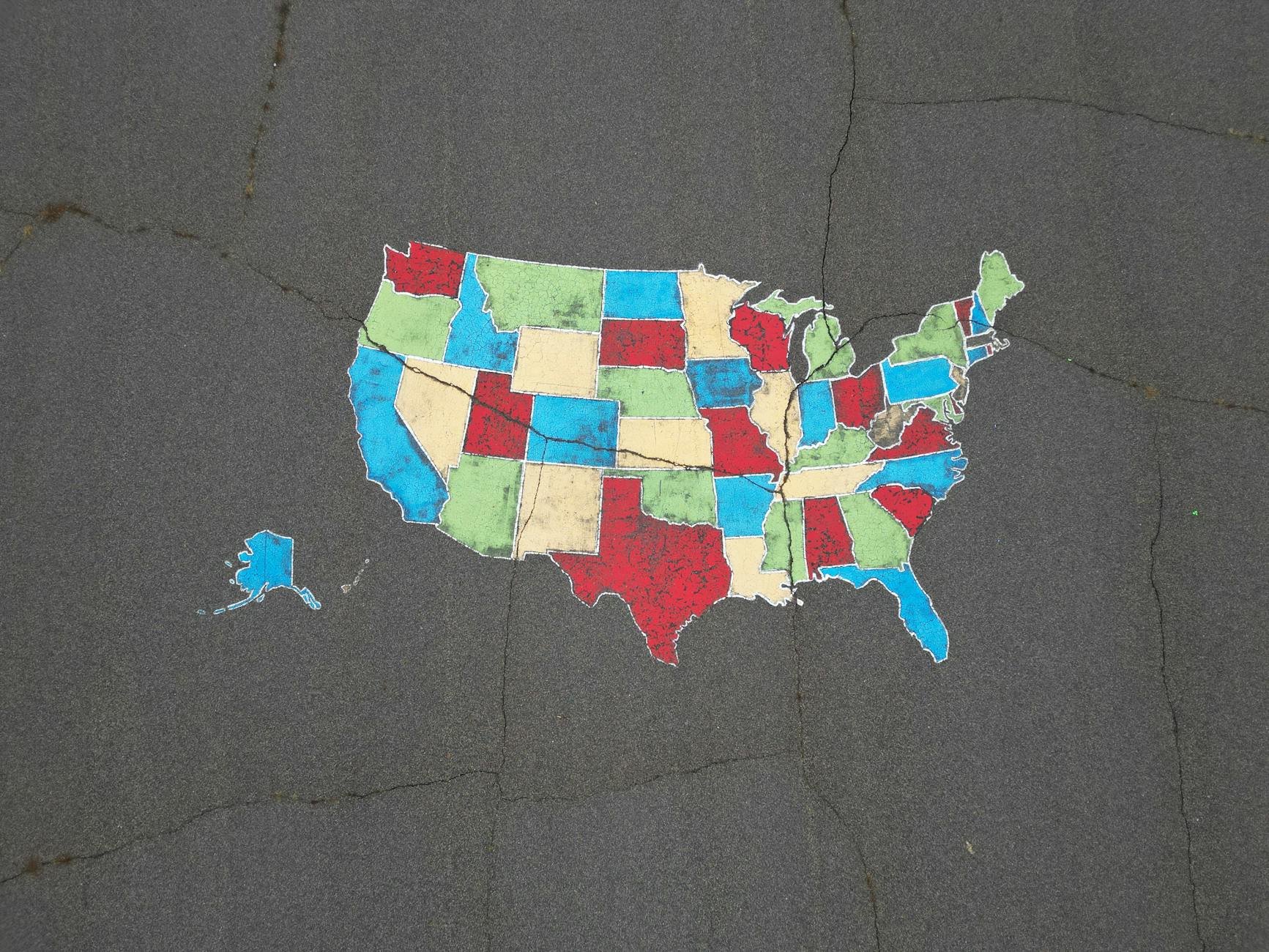
Map symbolization uses visual elements like points, lines, and areas to represent geographic data on a map.
It’s the backbone of cartography, turning complex data into understandable information.
With effective symbolization, a map becomes much more than just lines and shapes — it becomes a tool for understanding the world.
Symbolization communicates geographic information effectively.
By choosing the right symbols and visual variables, you can highlight critical features, trends, and patterns. For instance, using different colors or shapes to differentiate between land use types or population densities makes it easier for readers to understand the data at a glance.
Map symbolization has evolved alongside cartography itself.
Early maps relied on basic symbols like arrows and lines to represent rivers and paths. As mapping technology advanced, the variety and complexity of symbols increased.
Modern cartography incorporates a broad range of visual variables — size, shape, color, orientation, texture, and pattern.
With tools like GIS and digital mapping, maps have become more intricate, displaying layers of information that were unimaginable in the past.
Understanding Basic Concepts of Map Symbolization
Before diving into the process of symbolization, it helps to understand what map symbols actually are.
Map symbol is the individual units that symbolization assigns and arranges.
For a full breakdown of symbol types (point, line, and area), how to read them, and the standards cartographers use across different map types, see our dedicated guide: [What is a Map Symbol? Types, Examples, and How to Read Them].
Symbolization is the design system that sits on top of those units.
It’s the process of deciding which symbol goes where, how it looks, and what it encodes — and the primary tool for that work is the set of visual variables.
Visual Variables
Visual variables are the building blocks that make symbols distinct and meaningful. Think of them as the design knobs you turn to encode information visually.
Size
Size maps quantity to scale — larger symbols represent higher values or more significant features. A proportional circle map uses size to encode population or economic output directly.
Shape
Shape differentiates between categories or feature types. Different shapes — circles, squares, triangles, icons — help users distinguish hospital locations from schools or airports without relying on color alone.
Color
Color is the most expressive variable, capable of encoding both quantity and category. It must be selected carefully, however, since roughly 8% of men and 0.5% of women experience some form of color blindness.
Orientation
Orientation conveys direction or additional categorical information. Arrow symbols use orientation to show flow direction; hatching patterns use it to signal specific area types.
Texture
Texture adds another layer of distinction, especially in area maps. Two polygons filled with the same color but different textures remain visually distinguishable even in grayscale.
Pattern
Pattern differentiates areas or adds detail to symbols where solid fills would merge together or become monotonous at large extents.
Design Principles for Map Symbolization
Clarity
Clarity is non-negotiable. Symbols must be distinguishable from one another and from the background. Crowded or overly complex symbols confuse users and make the map hard to read — when in doubt, simplify.
Consistency
Consistency builds trust and reduces cognitive load. The same type of data should always be represented by the same symbol throughout the map, and ideally across a series of maps covering the same subject.
Balance
Balance prevents any single symbol or color from dominating the visual field. A well-balanced map presents a harmonious and accurate depiction of the data, where no single feature demands attention it doesn’t deserve.
Legibility
Legibility must hold across scales. Symbols that work on a city map might become cluttered or illegible when zoomed out to a regional view. Based on my experience, simplifying symbols at smaller scales is one of the most effective ways to maintain clarity without redesigning the map from scratch.
Color Theory
Color theory shapes accessibility. A well-thought-out color scheme ensures the map works for colorblind users as well as those with full color vision. Tools like ColorBrewer provide tested, accessible palettes for both categorical and quantitative data.
Hierarchy and Emphasis
Hierarchy and emphasis guide the reader’s attention. Symbols can vary in visual weight to create a clear hierarchy — primary features stand out, while secondary data remains visible but understated. This mirrors the principle of visual hierarchy in overall map design.
Symbolization Techniques
Proportional and Graduated Symbols
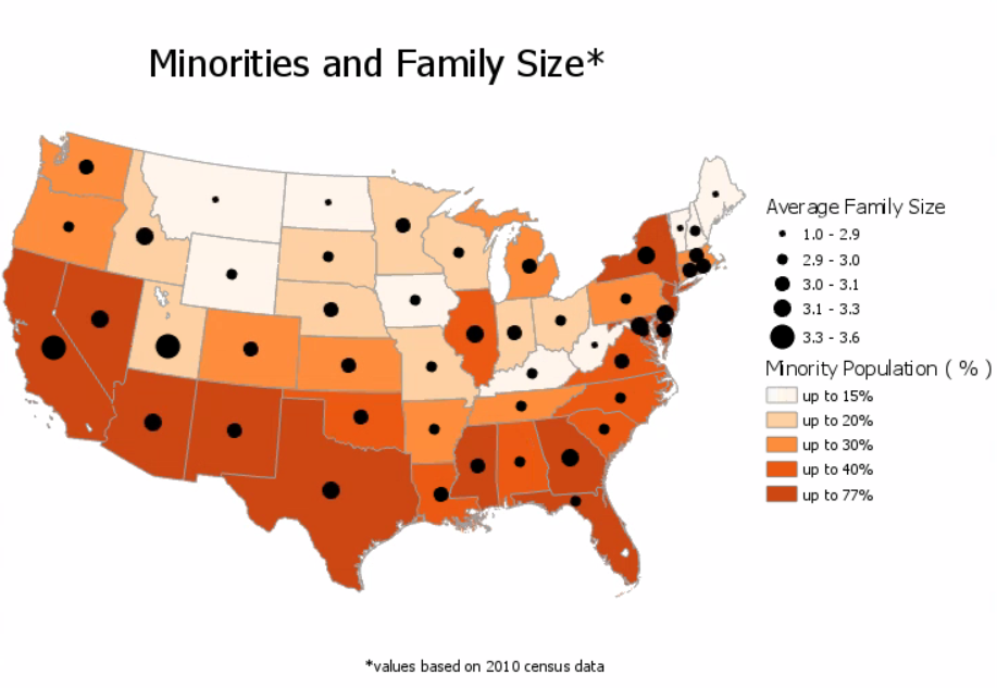
Proportional and graduated symbols adjust in size to represent different values. A series of circles might show population sizes, with larger circles indicating higher populations. Graduated symbols divide the data into steps or intervals, making it easier to compare categories clearly without requiring the reader to estimate exact values.
Choropleth Symbolization
Choropleth symbolization uses color gradients to show quantitative data across areas. Sequential color schemes work well for ordered data ranging from low to high. Diverging schemes highlight variation above or below a meaningful midpoint, such as comparing counties to a national average.
Isarithmic and Contour Symbolization
Isarithmic and contour symbolization represents continuous data using lines that connect points of equal value — contour lines on a topographic map being the most familiar example. This technique applies equally well to meteorological data, magnetic field strength, or any other continuously varying phenomenon.
Dot Density Maps
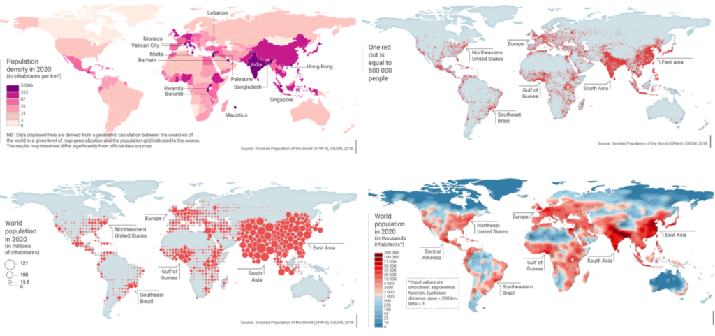
Dot density maps visualize data spread across an area by placing individual dots, each representing a set quantity. Population distribution is a classic use case: the density of dots reveals spatial patterns intuitively, without forcing the data into administrative boundaries.

Learn more about these map types in this article:
Tips and Tricks in Designing Map Symbols
Keep It Simple
Simple symbols are easier to read and faster to interpret. Avoid adding unnecessary detail that might confuse the map reader — every element of a symbol should earn its place.
Test Your Symbols with Real Users
A symbol that seems intuitive to the designer may confuse someone unfamiliar with the subject matter. Testing with a representative audience reveals blind spots before the map goes live.
Design for Color Blindness from the Start
Retroactively fixing a color scheme is harder than building an accessible one upfront. Tools like ColorBrewer flag colorblind-safe palettes explicitly — use them as your default, not your fallback.
Stay Consistent Throughout
Inconsistent symbol use forces the reader to re-learn the legend partway through the map. Consistency reduces cognitive load and keeps attention on the data where it belongs.
Challenges in Map Symbolization
Overlapping Symbols
Overlapping symbols present a significant challenge in dense areas. When symbols cluster together, the map becomes unreadable. Reducing symbol size, adjusting transparency, or switching to an aggregated representation — like a heat map or cluster icon — are practical solutions depending on the data type.
Color Blindness Considerations
Color blindness considerations affect more users than most cartographers expect. About 8% of men and 0.5% of women worldwide experience some form of color blindness. Designing with accessible palettes from the outset, rather than as an afterthought, ensures the map works for the full range of your audience.
Cultural Interpretations
Cultural interpretations can undermine even a technically well-designed map. A symbol that reads clearly in one cultural context may be confusing or carry unintended meaning in another. When designing maps for global or multicultural audiences, consider whether your symbol choices travel well across those boundaries.
Scalability
Scalability requires that symbols remain legible across the range of scales at which the map will be viewed. What looks balanced on a city map may become cluttered at regional scale, or too sparse at street level. Simplifying symbols at different zoom levels — or designing separate symbol sets for different scale ranges — maintains clarity throughout.
Symbolization in Thematic Mapping
Thematic maps focus on specific data points — population growth, land cover change, income inequality, environmental risk — and each type requires symbolization tailored to the data it carries.
Cartograms
Cartograms distort geographic areas based on the data they represent rather than physical geography. A country’s size on a cartogram might reflect its population or GDP instead of its land area. This technique sacrifices geometric accuracy to make quantitative relationships immediately visible — a deliberate trade-off that requires clear communication to the reader.
Flow Maps
Flow maps illustrate movement — migration patterns, trade routes, commuter flows. They use arrows or bands of varying width to indicate both the direction and volume of movement between locations, making spatial dynamics visible in a way that static point or area symbols cannot.
Future Trends in Map Symbolization
Dynamic Symbolization
Dynamic symbolization allows symbols to adapt in real time based on user interaction or live data feeds. Traffic symbols on digital maps already change color and size depending on current conditions — this principle will extend to more data types as real-time feeds become more accessible.
Augmented Reality (AR) and Virtual Reality (VR)
AR and VR have the potential to fundamentally change how users experience maps. Rather than reading a flat representation, users can immerse themselves in the data, viewing 3D symbols and interacting with spatial information in entirely new ways. Cartographers will need to develop new symbolization conventions suited to these immersive environments.
Machine Learning and AI
Machine learning and AI are beginning to assist directly in symbolization decisions. These technologies can analyze large datasets, identify patterns, and suggest optimal visual representations — reducing the trial-and-error that manual symbolization requires and helping cartographers produce effective maps faster.
Wrap Up
Map symbolization is essential to cartography, turning complex geographic data into visuals that readers can actually use. By grounding your design in the principles of clarity, consistency, balance, and hierarchy, you can create maps that are both functional and visually compelling.
As technology advances, thoughtful symbolization remains the constant at the center of good cartographic practice. Based on my observations, the cartographers who produce the most effective work aren’t necessarily the ones with the most sophisticated tools — they’re the ones who understand why each symbol choice matters and make those choices deliberately.
Happy mapping!
FAQ
What is map symbolization in simple terms?
Map symbolization is the design process of assigning visual properties to geographic data — deciding which symbols to use, how they look, and what they encode. Think of it as the grammar of maps: the individual symbols are the words, and symbolization is the system of rules that makes them communicate meaning together.
What is the difference between map symbols and map symbolization?
Map symbols are the individual visual units — the point, line, or area markers that represent specific features on a map. Map symbolization is the broader design process of selecting, styling, and assigning those symbols to data. One is the unit; the other is the system. For a deep dive into symbol types, standards, and how to read them, see our guide on map symbols.
What are the six visual variables in map symbolization?
The six visual variables are size, shape, color, orientation, texture, and pattern. Each encodes a different type of information — size works well for quantity, color for category or magnitude, shape for type, and so on. Effective symbolization uses these variables deliberately rather than arbitrarily.
How do I design maps that are accessible to colorblind users?
Use a colorblind-safe palette from the start rather than retrofitting one later. Tools like ColorBrewer provide palettes explicitly tested for colorblind accessibility across different types of color vision deficiency. Avoid relying on red-green distinctions alone, and consider supplementing color with shape or pattern differences to ensure features remain distinguishable without color.
What is a choropleth map and when should I use it?
A choropleth map uses color gradients to show quantitative data across geographic areas — income levels, election results, or disease rates, for example. Use it when your data is normalized by area or population (rates and percentages rather than raw counts), and when the geographic boundaries used for aggregation are meaningful to your audience. Avoid it for raw counts, where larger areas will visually dominate regardless of their actual values.
How is AI changing map symbolization?
AI and machine learning are beginning to automate symbolization decisions that previously required expert judgment — analyzing datasets, suggesting appropriate visual encodings, and optimizing symbol arrangements for clarity. In practice, this means faster iteration and more consistent outputs, especially for large or complex datasets. The cartographer’s role shifts toward curating and refining AI suggestions rather than making every decision manually from scratch.
Join the Community
What symbolization challenge has given you the most trouble on a project? Whether it was a color scheme that didn’t survive printing, overlapping symbols in a dense urban area, or finding the right technique for an unusual dataset — share it in the comments below.
If this guide was useful, pass it along to a colleague who’s working through their first thematic map. And if there’s a specific symbolization technique you’d like a deeper dive on, let us know.
Happy mapping!