Stare at a topographic map long enough and the landscape starts to speak.
Those curving, nested lines – packed tight on steep hillsides, spread wide across flat plains – are telling you exactly what the ground looks like without a single photograph.
Contour lines are lines on a map that connect all points sharing the same elevation.
That sounds simple. In practice, they’re one of the most information-dense tools in cartography, capable of communicating slope, landform shape, drainage patterns, and terrain complexity in a single visual layer.
For GIS professionals, cartographers, and anyone working with topographic data, understanding contour lines isn’t optional – it’s foundational.
This guide covers what contour lines are, how they behave, the five types you’ll encounter on topographic maps, how to read them accurately, and how they’re created from survey and remote sensing data.
Let’s dive in.
Contents
What Are Contour Lines?
The definition is clean and precise:
A contour line is a line that connects all points on a map that share the same elevation above a reference datum – usually mean sea level.
Think of it this way.
Imagine filling a valley with water, one meter at a time. Each time the water rises one meter, the shoreline it traces on the land is a contour line. When you drain the valley and draw all those shorelines onto a flat map, you get a contour map – a complete picture of the terrain’s vertical structure compressed into two dimensions.
That analogy captures the essential logic of contour lines: each line is a horizontal slice through the landscape at a specific elevation. Stacked together, those slices reconstruct the three-dimensional form of the ground.
In topographic cartography, contour lines are the dominant method for representing terrain relief because they provide both relative and absolute elevation information simultaneously.
Relative information comes from the pattern of the lines – their spacing, shape, and density. Absolute information comes from the elevation value labeled on each index contour. No other single cartographic technique delivers both in a single layer.
Contour Lines on Topographic Maps
Topographic maps are the natural home of contour lines, and the relationship between the two is worth understanding clearly.
A topographic map’s primary purpose is to represent the physical surface of the earth – its elevation, shape, and landforms – in a way that supports navigation, planning, and terrain analysis.
Contour lines carry almost the entire weight of that purpose.
Every other topographic feature (rivers, roads, vegetation boundaries) adds context, but contour lines carry the terrain itself.
From my experience teaching GIS workflows to field teams, the most common mistake beginners make is treating contour lines as decorative – background noise behind the “real” map features.
In practice, they’re often the most analytically valuable layer on the page. Slope calculations, drainage delineation, viewshed analysis, and cut-and-fill estimates all flow directly from contour data.
What Do Contour Lines Tell You?
Once you know that contour lines represent equal elevation, a second question immediately follows: What can you actually learn from reading them?
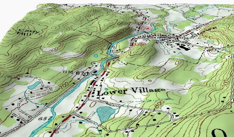
Quite a lot. The spacing, shape, and pattern of contour lines encode a remarkable amount of terrain information. Here’s what each property communicates.
Spacing Reveals Slope
The distance between adjacent contour lines on a map tells you the slope gradient of the terrain. This is the single most important reading rule for contour lines.
Closely spaced contour lines mean the elevation is changing rapidly over a short horizontal distance – a steep slope. Widely spaced lines mean elevation is changing slowly – a gentle gradient. Lines that merge or nearly touch indicate terrain so steep it approaches vertical: a cliff face.
In practice, reading contour spacing gives you an immediate intuitive sense of how hard a landscape will be to move through, where water will flow quickly versus pool, and where construction or agricultural activity is practical.
Shape Reveals Landform
The curvature and direction of contour lines reveal the type of landform you’re looking at. Two shapes in particular are worth memorizing.
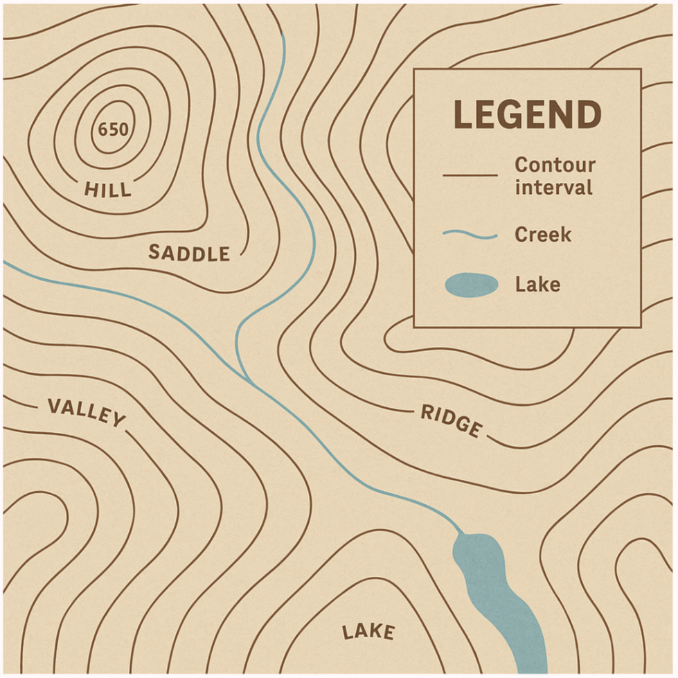
A V-shape pointing downhill – toward lower elevations – indicates a valley or drainage channel. Water flows toward the inside of the V. A V-shape pointing uphill – toward higher elevations – indicates a ridge or spur. Terrain rises toward the inside of that V. When contour lines form a U-shape pointing uphill, the landform is a rounded ridge rather than a sharp one.
Closed loops – contour lines that circle back on themselves without reaching the map edge – indicate either a hill or a depression, depending on context.
If the loops are nested concentrically with rising values toward the center, you’re looking at a hill or peak. If the values decrease toward the center, or if small tick marks point inward, it’s a closed depression.
Density Reveals Topographic Complexity
Areas of the map where contour lines are dense and irregular indicate highly complex terrain – broken ground, dissected plateaus, or mountainous areas with many landform types in close proximity. Areas of sparse, regular contour lines indicate simple, smooth terrain: gentle hills, plains, or alluvial flats.
As I’ve observed in terrain analysis work, contour density is a surprisingly reliable proxy for how challenging a landscape is to work in – for field surveys, infrastructure planning, or environmental assessment.
A quick visual scan of contour density before a site visit tells you more about expected conditions than most verbal descriptions.
What Are the Five Types of Contour Lines?
Not all contour lines on a topographic map are the same. Cartographers use five distinct types, each serving a specific purpose within the overall terrain representation.
Index Contours
Index contours are the bold, thicker contour lines that appear at regular elevation intervals – typically every fifth contour line. They carry the elevation label: the number printed along the line that tells you its absolute height above the reference datum.
The purpose of index contours is readability.
Without them, a densely contoured map would require you to count every line from the edge of the map to determine any given elevation. Index contours give you fixed reference points at regular intervals so you can quickly establish your elevation context and count up or down from there.
The interval at which index contours are drawn depends on the map scale and the contour interval.
Common index intervals include multiples of 5 (5, 10, 15 meters) or multiples of 50 (50, 100, 150 meters) – values chosen specifically because they’re easy to read and count.
Intermediate Contours
Intermediate contours are the regular, thinner contour lines that fill the space between index contours. They represent the standard contour interval of the map and are the lines you’ll spend most of your time reading.
Intermediate contours may or may not carry elevation labels, depending on available map space. On large-scale maps with generous space between contours, labels are common.
On small-scale or densely contoured maps, intermediate contours are typically unlabeled – their elevation inferred by counting from the nearest index contour.
Supplementary Contours
Supplementary contours – sometimes called auxiliary contours – are drawn between the standard contour interval, at fractional values such as half, one-third, or one-quarter of the base contour interval.
Their purpose is to add detail in areas where the standard interval produces unhelpfully sparse contour lines – typically flat terrain where a 25-meter or 50-meter interval would leave large blank areas that give no terrain information.
By adding contours at a smaller interval in those areas, the cartographer recovers the lost detail without changing the interval for the entire map.
Supplementary contours are drawn as dashed lines or dotted lines to visually distinguish them from the standard interval lines. The distinction matters: a reader who mistakes a supplementary contour for a standard one will misread the terrain slope.
Depression Contours
Depression contours represent closed topographic depressions – basins, sinkholes, craters, and other landforms where the terrain dips below the surrounding surface without an outlet.
On a standard contour map, a closed depression and a hilltop would look identical: both appear as nested concentric closed loops. Depression contours solve this ambiguity by adding small tick marks – hachures – perpendicular to the contour line, pointing inward toward the lowest point of the depression.
In practice, depression contours appear most frequently in karst landscapes (limestone dissolution features), volcanic terrain, and areas with significant surface subsidence.
Based on my experience with land cover and geomorphology work, they’re also commonly encountered in agricultural plains where irrigation basins or ponds have been excavated.
Carrying Contours (Combined Contours)
Carrying contours – also called combined contours – appear when multiple contour lines converge so closely at the map scale that drawing them individually would produce an illegible tangle of overlapping lines.
Rather than attempting to show each line separately, the cartographer merges them into a single thick line that represents the combined vertical range.
This situation arises most commonly on extremely steep slopes – near-vertical cliff faces, fault scarps, or deeply incised river gorges – where many contour intervals collapse into a very short horizontal distance on the map.
A carrying contour is not an error or a simplification of the terrain; it’s a deliberate cartographic solution to an overplotting problem at a specific scale.
[FIGURE 3] Figure Title: Visual comparison of all five contour line types on a single map section Alt Text: A topographic map excerpt with five contour types labeled and color-coded: bold labeled lines for index contours, thin solid lines for intermediate contours, dashed lines for supplementary contours, closed lines with inward tick marks for depression contours, and a single thick merged line for carrying contours on a steep slope
How to Read Contour Lines
Reading contour lines accurately is a learnable skill, and it follows a consistent set of rules. Once these rules become instinctive, a topographic map becomes as readable as a photograph of the landscape.
There are two fundamental things you read when interpreting contour lines: spacing density (which tells you slope gradient) and curve direction (which tells you which way the slope faces – toward a ridge or toward a valley).
Step 1: Establish Your Elevation Reference
Before reading any terrain detail, locate the nearest index contour and read its elevation value. This gives you your vertical anchor point. From there, count intermediate contours up or down to determine the elevation of any specific point on the map.
Always check the map legend for the contour interval before starting. Without knowing the interval, the numerical value of each line is uninterpretable.
Step 2: Read Spacing for Slope Gradient
Scan the contour spacing across the area you’re analyzing. Where lines pack tightly together, the terrain is steep. Where they spread apart, the terrain is gentle. Where they essentially disappear, the ground is nearly flat.
For field navigation or site assessment, this step takes about three seconds and gives you the most operationally important terrain information: where the hard ground is.
Step 3: Read Curve Direction for Landform Type
Follow the shape of the contour lines through the area. Look for V-shapes, U-shapes, and closed loops. Apply the rules: V pointing downhill is a valley; V pointing uphill is a ridge; closed concentric loops with rising values are a hill; closed loops with inward tick marks are a depression.
In drainage analysis, this step is where you identify the stream network – valleys indicated by downhill-pointing V-shapes trace the watercourses. This is the manual equivalent of what GIS tools like QGIS’s drainage delineation algorithms do automatically from a DEM.
Step 4: Synthesize the Whole Terrain Picture
Once you’ve read spacing and shape across the area, step back and read the whole map section as a landscape.
You should be able to identify the major ridgelines, valley systems, peaks, and flat areas – and describe the terrain verbally without looking at any other map layer.
From what I’ve seen in GIS training contexts, this synthesis step is where real contour line literacy shows. It separates people who can read individual rules from people who actually understand terrain.
How Are Contour Lines Created?
Contour lines don’t come from a single source or process. They’re generated from elevation point data, and the quality of the contours depends directly on the quality, density, and currency of that underlying data.
Elevation Data Sources
The first step in creating contour lines is acquiring elevation data – a set of points with known horizontal positions and vertical heights.
Common sources include direct field survey using total stations or GPS receivers, photogrammetric processing of aerial or satellite stereo imagery, airborne LiDAR scanning, and existing topographic maps or DEM datasets.
The choice of source depends on the scale and purpose of the mapping.
A detailed engineering survey requires GPS or total station measurements at high point density. A regional terrain model can use LiDAR or photogrammetric data. A small-scale overview map can derive contours directly from a global DEM such as SRTM or ALOS World 3D.
Interpolation
Once elevation points are collected, contour lines are generated through interpolation – the process of estimating elevation values at locations between known measurement points, then connecting all points at each target elevation value into a continuous line.
Two interpolation methods are used in cartographic practice.
Linear interpolation estimates the position of each contour crossing along a line between two known elevation points using proportional calculation.
For instance, if one survey point sits at 48 meters and an adjacent point at 53 meters, and you’re drawing the 50-meter contour, linear interpolation places the 50-meter crossing point 40% of the way along the line between them. It’s mathematically simple and computationally fast – well-suited for regular survey grids.
Graphical interpolation divides the line between two points using a parallel-line overlay at a proportionally scaled interval, then marks the contour crossing geometrically. It was the standard manual method before digital processing and is still taught as a conceptual foundation even when the actual work is done in GIS.
In modern GIS workflows, both methods are abstracted behind interpolation algorithms – TIN (Triangulated Irregular Network), kriging, spline, or IDW (Inverse Distance Weighting) – that operate on full point clouds rather than point pairs.
QGIS and ArcGIS both offer contour generation tools that accept a DEM or point layer as input and produce vector contour lines as output.
What Is the Contour Interval and Why Does It Matter?
The contour interval (CI) is the vertical distance between two adjacent contour lines. It is one of the most consequential decisions a cartographer makes when producing a topographic map, and it affects everything from legibility to analytical precision.
Choosing the Right Contour Interval
There is no universal formula that determines the correct contour interval for every mapping situation. The decision depends on three interacting factors: map scale, terrain type, and mapping purpose.
Map scale is the primary driver. Large-scale maps (1:10,000 or 1:25,000) can support small contour intervals – sometimes as fine as 1 or 2 meters – because the generous map space allows lines to be spaced far apart even in steep terrain. Small-scale maps (1:250,000 or smaller) require larger intervals – 50 or 100 meters – to prevent the contour lines from overplotting into illegibility.
A commonly used rule-of-thumb formula for CI is:
CI = Map Scale Denominator / 2000
For a 1:50,000 map, this gives CI = 25 meters. For a 1:100,000 map, CI = 50 meters. These are starting points, not fixed rules – terrain conditions and mapping purpose may justify departing from them.
Terrain type matters because the same interval that works beautifully in mountainous terrain creates an almost blank map over a coastal plain.
In flat areas, a 50-meter interval may produce only two or three contour lines across the entire sheet, conveying almost nothing about the actual ground surface. Supplementary contours at a smaller interval solve this problem, but the base interval must be set with the dominant terrain type in mind.
Mapping purpose sets the required precision.
A detailed engineering survey for road design needs much finer elevation resolution than a regional land use planning map. The contour interval should match the analytical decisions the map is meant to support.
Using Two Contour Intervals in One Map
For areas that contain both steep and flat terrain within a single map sheet, using a single contour interval is a compromise that serves neither zone well. A 25-meter interval leaves flat areas underrepresented; a 12.5-meter interval overcrowds the hilly zones.
The solution is to apply two contour intervals within the same map: a smaller interval for the flat areas and a larger interval for the hilly terrain.
Visually, the two interval zones are differentiated by color – typically different shades of brown – so the reader can immediately identify which interval applies in any given area.
FAQ
What is the difference between a contour line and a contour interval?
A contour line is the individual line on the map connecting all points at a specific elevation. The contour interval is the vertical distance between two adjacent contour lines – it’s a property of the map, not any individual line. For example, on a map with a 20-meter contour interval, each contour line is 20 meters higher or lower than the lines immediately adjacent to it.
Why do contour lines never cross each other?
Contour lines represent a single specific elevation. If two contour lines at different elevations crossed, it would mean one point on the ground simultaneously has two different elevations – which is physically impossible on natural terrain. The only apparent exception is an overhanging cliff, which genuinely has two elevations above a single horizontal point, and which requires a special cartographic treatment outside of standard contour representation.
How do I generate contour lines from a DEM in QGIS?
In QGIS, go to Raster > Extraction > Contour. Select your DEM layer as input, set the contour interval in the “Interval between contour lines” field, and run the tool. The output is a vector line layer with an elevation attribute for each contour. From there, you can apply symbology to differentiate index and intermediate contours based on the elevation value. For smoother contours, apply a Gaussian smoothing filter to the DEM before running the contour extraction.
What does it mean when contour lines are very close together?
Closely spaced contour lines indicate steep terrain – the elevation is changing rapidly over a short horizontal distance. When contour lines touch or merge into a single line (a carrying contour), the terrain is near-vertical or vertical: a cliff face, a fault scarp, or a deeply cut riverbank. In field navigation terms, tightly packed contours are a warning to slow down and assess the terrain carefully before proceeding.
Can contour lines split or branch?
No. A contour line must close on itself – either within the map extent or beyond the map edge – and it cannot branch or split. Each contour line represents a single, continuous elevation level. If you see what appears to be a branching contour line on a map, it’s either a supplementary contour beginning (often indicated by a dashed line) or a cartographic error.
What is a depression contour and when is it used?
A depression contour represents a closed topographic low – a basin or hollow where the terrain dips below the surrounding surface. It looks like a normal closed contour loop but carries small inward-pointing tick marks (hachures) to distinguish it from a hilltop. Depression contours appear most often in karst terrain (sinkholes), volcanic areas (craters and calderas), glacial landscapes (kettles), and areas with significant subsidence or excavation.
Wrap Up
Contour lines are one of cartography’s most enduring inventions – a method for encoding the three-dimensional world onto a flat surface that has remained essentially unchanged for over two centuries, because it works.
Understanding map contours at the level covered in this guide means more than being able to read a topographic map.
It means you can think spatially about terrain, interpret the shape of the ground from abstract line patterns, and make sound decisions about contour interval selection when creating maps of your own.
For GIS professionals, that spatial literacy directly improves the quality of terrain analysis work – from drainage delineation to slope modeling to site assessment.
The contour line is simple in concept and powerful in practice. That combination is rare in cartography, and it’s worth mastering.
Happy mapping!
Keep Sharpening Your Skills
Have a workflow for generating or styling contour lines in QGIS or ArcGIS that you’ve refined over time?
Share it in the comments – I’d love to hear what settings and approaches have worked best for your terrain types.
And if you’re working through the fundamentals of topographic map reading, let me know in the comments what topics you’d like covered next.
There’s a lot more terrain to explore.