Euclidean distance and network distance in GIS answer different questions. Learn when each applies, how they compare, and how to run service area analysis.
Draw a 10-minute buffer around a fire station on a map.
You get a circle.
Every address inside that circle, your analysis tells you, sits within 10 minutes of emergency response.
Now run a 10-minute network drive-time service area from the same station.
The shape that comes back is irregular, asymmetric, and noticeably smaller than the circle.
It follows the roads.
It stops at the river where the only bridge is 3 kilometers upstream.
It reaches further along the highway than the circle suggested, and far less into the neighborhood cut off by the rail line.
One of those shapes answers the question you asked.
The other one just looks like it does.
Contents
- 1 What Is Euclidean Distance in GIS?
- 2 What Is Network Distance in GIS?
- 3 Euclidean vs Network Distance: The Comparison
- 4 What Is Nearest Neighbor Analysis in GIS?
- 5 How to Run Network Distance Analysis in GIS
- 6 Wrap Up
- 7 FAQ
- 7.1 What is the difference between Euclidean distance and network distance in GIS?
- 7.2 When should you use network distance instead of Euclidean distance?
- 7.3 What is a service area in GIS network analysis?
- 7.4 What are Thiessen polygons used for in GIS?
- 7.5 What does nearest neighbor analysis tell you in GIS?
- 8 What’s Next
What Is Euclidean Distance in GIS?
Euclidean distance is the straight-line distance between two points in a two-dimensional coordinate space.
It is the distance you measure with a ruler on a flat map: the shortest geometric path between two locations, computed without any reference to roads, terrain, or physical barriers.
The name comes from Euclidean geometry, and the calculation comes from the Pythagorean theorem.
In two dimensions, the distance between point A at coordinates (x1, y1) and point B at (x2, y2) is the square root of the sum of the squared differences in each axis.
In GIS, that calculation runs across thousands or millions of cell pairs simultaneously.
In raster analysis, a Euclidean distance surface calculates the straight-line distance from every cell in a raster grid to the nearest source feature.
The output is a continuous surface where each cell value is its distance from the nearest source, rising uniformly outward.
When you generate a Euclidean buffer around a point, you are essentially drawing the contour line of that surface at a defined distance threshold.
When Euclidean Distance Is the Right Choice
Euclidean distance is the correct model when the phenomenon you are analyzing genuinely moves unconstrained through space, without following any network or encountering any landscape resistance.
Radio frequency propagation is the clearest example.
A cell tower’s signal radiates outward in all directions from the antenna, attenuating with distance. Modeling that coverage as a Euclidean distance zone around the tower is geometrically and physically accurate. The signal does not follow roads.
Line-of-sight analysis is another clean application.
Whether a proposed wind turbine is visible from a sensitive viewpoint depends on the straight-line path between them through the terrain, not on how you would drive from one to the other. Viewshed analysis, a close relative of distance analysis, operates on the same Euclidean logic.
Regulatory geometric setbacks are a third application where Euclidean distance is not only acceptable but legally correct.
A 50-meter riparian buffer is defined as a geometric distance from the watercourse edge, full stop. The regulation does not ask how long it takes to walk there from the nearest road. It defines a spatial zone of exclusion, and Euclidean buffer analysis implements that zone correctly.
Where Euclidean Distance Breaks Down
The limitation of Euclidean distance is not subtle. It ignores every physical and infrastructural constraint on movement.
A river with no bridge.
A highway with no pedestrian crossing.
A railway line that bisects a neighborhood. A hillside steep enough to take 40 minutes to climb.
Euclidean distance treats all of these as transparent, as if movement flows straight through them at constant speed. For any phenomenon that actually has to navigate those barriers, the Euclidean answer is wrong.
From my experience, the overestimation error is not marginal in most real-world contexts.
A 1-kilometer Euclidean buffer around a health clinic in an urban area routinely includes residential populations that require a 3- or 4-kilometer road journey to reach the clinic. The buffer says they are close. The road network tells a different story.
![[FIGURE 1] Figure Title: Euclidean Distance Surface and Buffer Zone Alt Text: Two-panel diagram illustrating Euclidean distance in GIS. Left panel shows a Euclidean distance raster surface generated from a single source point (health clinic), displayed as a continuous color ramp from dark green (low distance, near source) through yellow to dark red (high distance, far from source), with circular isoclines at equal distance intervals radiating outward uniformly in all directions regardless of terrain or road network. Right panel shows the same source point with a 1-kilometer Euclidean buffer rendered as a perfect circle overlaid on a street map that includes a river with limited crossing points and a railway line, illustrating how the circular buffer crosses physical barriers that would prevent direct travel in reality.](https://www.saddhussein.com/wp-content/uploads/2026/04/image-6-1024x567.png)
What Is Network Distance in GIS?
Network distance measures travel through a connected infrastructure system: roads, pedestrian paths, cycling routes, utility networks, river systems.
Unlike Euclidean distance, which treats space as open and uniform, network distance reflects the actual routes that people, vehicles, and goods travel through the built environment.
Think of it as the difference between how a bird travels and how a commuter travels.
The bird flies in a straight line.
The commuter follows streets, waits at intersections, and detours around barriers. Network distance models the commuter’s experience. Euclidean distance models the bird’s.
What Network Analysis Requires
Network distance analysis requires a network dataset: a set of line features representing the infrastructure links, connected at nodes, with travel impedances encoded at the link and node level.
For road network analysis, that means:
- road segments with travel speed or time attributes,
- intersection nodes with turn restrictions and delay penalties,
- one-way restrictions and access limitations, and
- in more detailed models, traffic signal timing and turn-movement impedances.
Building that dataset correctly is not trivial. Topological errors, disconnected nodes, and missing turn restrictions all produce routing errors that compound when you are running geospatial analysis across an entire city or region.
For pedestrian network analysis, the requirements shift.
Vehicle travel speeds drop out. Footpath connectivity becomes critical, including stairways, pedestrian crossings, underpasses, and barriers like locked gates or private land that break the network.
A pedestrian network that omits footpath links or marks roads as non-walkable produces service areas that underestimate pedestrian accessibility.
Service Area Analysis
Service area analysis is the network distance equivalent of a buffer: the geographic extent reachable from a source location within a defined travel time or distance threshold through the network.
The output is a polygon, but it looks nothing like a circle. It extends further along fast roads and major streets, where vehicles cover ground quickly. It reaches less far in directions where the road network is sparse, fragmented, or slow. It stops entirely where barriers break network connectivity.
A 10-minute drive-time service area from a fire station follows the road network outward from the station, terminates at the points where 10 minutes of travel time is exhausted in each direction, and produces a polygon whose shape reflects the actual road geometry. That polygon is the correct answer to the question: what can a fire crew reach in 10 minutes? The Euclidean circle is not.
As I’ve observed across multiple facility accessibility projects, the most consequential discrepancies appear in two situations: dense urban street grids where turns and intersections slow network travel below what the straight-line distance implies, and peri-urban or rural areas where a sparse road network means the accessible area along roads is large but the accessible area perpendicular to roads is near zero.

Euclidean vs Network Distance: The Comparison
Choosing between Euclidean distance and network distance in GIS comes down to one question: does the phenomenon you are modeling follow infrastructure, or does it propagate through open space?
| Euclidean Distance | Network Distance | |
|---|---|---|
| Movement assumption | Unconstrained, equal in all directions | Follows connected infrastructure |
| Data required | Source features only | Topologically correct network dataset |
| Output | Distance raster or circular buffer | Service area polygon or route |
| Computation | Fast, simple | Requires routing algorithm (Dijkstra’s) |
| Appropriate for | RF coverage, setbacks, preliminary screening | Human mobility, vehicle routing, utility access |
| Fails when | Movement follows roads or encounters barriers | Network data is unavailable or incomplete |
The comparison table captures the analytical tradeoff. Euclidean distance is fast and requires nothing beyond the source features. Network distance is more demanding but produces results that reflect how movement actually works through the built environment.
The Gap Is Largest Where It Matters Most
In practice, the difference between a Euclidean buffer and a network service area is not random. It is largest exactly where access is most constrained.
Dense urban environments with complex street grids produce service areas that cover a fraction of the equivalent Euclidean buffer area. Areas fragmented by rivers, railways, highways, and industrial land use produce service areas that are highly asymmetric, reaching far in some directions and barely at all in others. These are also the environments where accurate accessibility measurement matters most, because they tend to contain the populations with the least mobility and the greatest dependence on nearby services.
Applying a Euclidean buffer analysis in those contexts produces an accessibility map that flatters the situation. It is not a conservative approximation. It is a systematic overestimate of who can actually reach what.
When Each Applies
Euclidean distance belongs in your workflow when movement is genuinely unconstrained, when network data is unavailable, or when a rough preliminary screen is all the analysis requires before a more rigorous method takes over.
Network distance belongs in your workflow whenever the phenomenon involves human movement, vehicle routing, utility service delivery, or any other process that follows infrastructure. If the question includes the word “access,” “reach,” “travel,” or “connectivity” in any form, network distance is almost certainly the right tool.
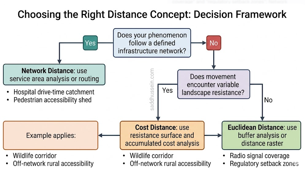
[FIGURE 3] Figure Title: Choosing the Right Distance Concept: Decision Framework Alt Text:
What Is Nearest Neighbor Analysis in GIS?
Nearest neighbor analysis characterizes the spatial distribution of a point dataset by comparing observed distances between neighboring points to what a random distribution would produce at the same density.
The average nearest neighbor statistic calculates the mean distance from each point to its nearest neighbor, then compares that observed mean to the expected mean under complete spatial randomness, which is derived from the point density and study area size. The ratio of observed to expected distance is the ANN statistic.
Values below 1 indicate clustering: observed distances are shorter than random expectation, meaning points sit closer together than chance would produce. Values above 1 indicate dispersion: points are more spread out than random expectation. Values near 1 suggest randomness.
The ANN statistic comes with a z-score and p-value that test the statistical significance of the pattern.
A statistically significant clustered result is evidence that a non-random process is concentrating points spatially, whether that is an environmental gradient, an underlying spatial structure, or a behavioral mechanism pulling points toward each other.
Ripley’s K Function
Ripley’s K function extends nearest neighbor analysis across a range of distance scales rather than just the single scale of the nearest neighbor.
It calculates the degree of clustering or dispersion at each of a set of distance thresholds, revealing whether a pattern is clustered at short distances but dispersed at larger scales, or clustered across all distances, or shifts between the two.
For disease cluster analysis, K function results reveal whether cases cluster at the neighborhood scale, suggesting local transmission or a localized exposure source, or at the city scale, suggesting a broader environmental factor.
For species occurrence analysis, K function reveals the distance scale at which habitat aggregation drives species clustering, information that single-scale nearest neighbor statistics cannot provide.
Nearest Neighbor vs Kernel Density
These two approaches answer related but distinct questions.
Use nearest neighbor analysis when you want to know whether a distribution is clustered or dispersed across the dataset as a whole. Use kernel density estimation when you want to know where density is highest within the dataset.
In crime analysis, nearest neighbor analysis tests whether crime is spatially clustered overall. Kernel density estimation maps the hotspots where crime density peaks within the city. Both are proximity-based analytical tools. Neither substitutes for the other.
How to Run Network Distance Analysis in GIS
Network distance analysis is available in all major GIS platforms, but it requires a properly prepared network dataset before any routing or service area calculation can run.
If you use QGIS:
The QNEAT3 plugin provides network analysis tools including service area calculation and shortest path routing.
Install it from the Plugin Manager.
Your road network needs to be a polyline layer with no topological errors. The GRASS module v.net.iso also runs service area analysis natively if you have GRASS tools enabled. For pedestrian accessibility, OSMnx in Python paired with QGIS visualization is often the cleaner workflow.
If you use ArcGIS Pro:
The Network Analyst extension handles service area analysis, routing, and origin-destination matrix calculations.
You build a network dataset from your road layer in a file geodatabase, encoding travel speed, one-way restrictions, and turn rules.
From there, the Service Area tool under Network Analyst generates drive-time or walk-time polygons directly.
ArcGIS Online also exposes network routing through the Living Atlas routing services, useful when you need a quick result without building a local network dataset.
If you work in Python:
OSMnx is the most practical route for most analysts. It downloads road network data directly from OpenStreetMap for any location, builds a routable graph, and integrates with NetworkX for shortest path and service area calculations.
import osmnx as ox
import networkx as nx

# Download walkable street network for a city
G = ox.graph_from_place("Nairobi, Kenya", network_type="walk")

# Find the nearest node to a clinic location
clinic_lat, clinic_lon = -1.2921, 36.8219
center_node = ox.nearest_nodes(G, clinic_lon, clinic_lat)

# Get all nodes within 15 minutes walking (900 seconds)
# Using ego_graph with distance in meters (approx 1km = 12 min walk)
subgraph = nx.ego_graph(G, center_node, radius=900, distance="travel_time")

# Get the bounding geometry of the reachable nodes
reachable_nodes = ox.graph_to_gdfs(subgraph, edges=False)
For service area polygons from the reachable node set, use alphashape or convex hull on the reachable node coordinates. OSMnx’s documentation covers this workflow in detail.
If you use R:
The dodgr package handles network distance and routing on street networks downloaded via osmdata.
The sfnetworks package provides a tidy approach to network analysis that integrates cleanly with sf and dplyr workflows.
For straightforward service area mapping, stplanr builds on both.
Wrap Up
The choice between Euclidean and network distance is not a technical preference. It is an analytical commitment about what kind of movement you are modeling.
Euclidean distance is correct when movement is genuinely free. Network distance is correct when movement follows the roads, paths, and infrastructure of the built world. Getting that choice wrong does not produce a slightly imprecise answer.
It produces a fundamentally different map that misleads any decision made from it.
Thiessen polygons and nearest neighbor analysis are proximity tools with their own bounded applications: nearest-source allocation and point pattern statistics respectively. Both operate in Euclidean space, which shapes where they apply and where they fall short.
Know what your phenomenon does in space. Build your distance analysis around that.
FAQ
What is the difference between Euclidean distance and network distance in GIS?
Euclidean distance is the straight-line distance between two points, calculated as if space is open and movement is unconstrained in all directions. Network distance measures travel through a connected infrastructure system, following the actual routes that people and vehicles use through roads, paths, and connections. Euclidean distance is simpler to compute and requires no network data. Network distance reflects how movement actually works in the built environment and is required for any accessibility analysis involving human mobility.
When should you use network distance instead of Euclidean distance?
Use network distance whenever the phenomenon you are analyzing moves through infrastructure. Human accessibility to services, vehicle routing, pedestrian shed analysis, utility service delivery: all of these require network distance. Use Euclidean distance when movement is genuinely unconstrained through space, such as radio signal propagation, line-of-sight analysis, or regulatory geometric setbacks. If the question involves how people reach a place, the answer requires network distance.
What is a service area in GIS network analysis?
A service area is the geographic extent reachable from a source location within a defined travel time or distance threshold through a road or pedestrian network. It is the network distance equivalent of a buffer: where a buffer produces a circle, a service area produces an irregular polygon shaped by the road network. Service areas extend further along fast roads and major streets, are constrained by barriers that break network connectivity, and stop where travel time runs out in each direction. They are the correct output for accessibility analysis involving human or vehicle mobility.
What are Thiessen polygons used for in GIS?
Thiessen polygons, also called Voronoi diagrams, divide a spatial extent into zones where every location is assigned to its nearest seed point. They are used in hydrology to weight rain gauge measurements by the area each gauge represents, in service planning to produce preliminary catchment zones around facilities, and in ecology to characterize individual territorial extents. Their core limitation is that the boundaries reflect Euclidean equidistance rather than network equidistance, making them unreliable for service catchment delineation wherever road network structure significantly shapes how people actually reach facilities.
What does nearest neighbor analysis tell you in GIS?
Nearest neighbor analysis tests whether the spatial distribution of a point dataset is clustered, dispersed, or random, by comparing observed inter-point distances to the distances expected from a random distribution at the same density. The average nearest neighbor statistic quantifies the overall spatial pattern. Ripley’s K function extends the analysis across multiple distance scales, revealing whether clustering or dispersion operates at local scales, regional scales, or both. Nearest neighbor analysis characterizes the global pattern of a distribution. Kernel density estimation maps the local density peaks within it. Both are useful; neither substitutes for the other.
What’s Next
Distance through a network is one way to model movement. But not all movement follows discrete infrastructure.
Wildlife does not travel on roads.
Floodwater does not follow streets.
Emergency evacuation does not always have an intact network to rely on.
When movement encounters spatially variable resistance across a continuous landscape rather than a discrete infrastructure system, cost distance analysis is the right tool.
The next article in this series covers [Cost Distance Analysis in GIS]: resistance surfaces, accumulated cost, least cost path, and the full workflow for wildlife corridor identification.
Questions about network distance analysis, service area setup, or when to use Thiessen polygons over network catchment zones?
Drop them in the comments. Let’s work through it.
Happy mapping!