Did you know that the design of a map can make or break how well you understand complex spatial data?
A well-designed map doesn’t just look good.
It communicates information clearly and effectively, guiding you through patterns and relationships in the data.
Map design is the process of planning and arranging elements on a map to communicate geographic information clearly and effectively. It involves choosing appropriate symbols, colors, typography, and layout to ensure the map is both functional and visually appealing.
Good map design enhances your ability to interpret data and make informed decisions based on spatial information.
In this article, you’ll dive into the fundamentals of map design, explore key principles, and see how you can apply these techniques to create your own stunning, functional maps.
Let’s jump in!
Contents
What is Map Design?
Map design is the art and science of making maps that effectively communicate spatial information without compromising data accuracy.
It involves selecting the right symbols, colors, typography, and layout to ensure that a map is both aesthetically pleasing and easy to understand.
At its core, map design is about clarity and purpose — turning complex data into visual stories that users can quickly grasp.
Why is Map Design Critical in Cartography and GIS?
Good map design is essential because it directly impacts how well the map communicates information.
A poorly designed map can confuse users, making it difficult to interpret data or navigate.
In contrast, a well-designed map simplifies the complex, making patterns and relationships in the data obvious to the user.
In my experience, effective map design can:
- Enhance understanding of complex spatial relationships: When visualized correctly, even the most complicated geographic data becomes easier to digest.
- Guide users to make informed decisions: Well-designed maps offer clear insights that help decision-makers choose the best course of action.
- Communicate important information quickly and clearly: In situations where time is of the essence, a thoughtfully designed map can convey critical information in seconds.
- Make data more accessible to non-experts: A good map translates technical data into something that anyone, regardless of expertise, can understand.
- Influence policy and public opinion: The power of a clear map can sway public opinion and inform policymakers by visually presenting issues in a compelling way.
First Thing to Consider When Designing a Map
When you set out to design a map, it’s crucial to get a few foundational elements right before diving into aesthetics. These initial considerations will guide the rest of your design process, ensuring that the final product is both functional and visually effective.
1. Map Purpose
The first question to ask yourself is: What is the purpose of this map?
Every map has a unique job to do, whether it’s helping someone navigate a city, analyze environmental data, or understand demographic trends.
The map’s purpose will determine the type of data you include and how you present it.
For instance, when I was designing a map for tracking wildlife conservation efforts, the goal was to clearly show areas where we had patrolled. The design needed to highlight those regions while ensuring that other less critical data didn’t overwhelm the viewer.
2. Map Reader
Who will be using the map?
Understanding your audience is just as important as understanding the data.
A map for the general public will look very different from one designed for an expert audience. Keep in mind your reader’s familiarity with the data and adjust complexity accordingly.
From my experience, simplifying symbology and using clear, non-technical language makes the map accessible to a wider audience.
If your readers are experts, more intricate details and industry-specific symbols are acceptable.
3. Map Media
What platform will the map be displayed on?
Is it a static print map, an interactive web map, or maybe a mobile map?
Each medium has its own set of design requirements.
- Static Maps: Often used for print, these maps need clear, concise designs since users can’t interact with them.
- Interactive Web Maps: These allow for more complexity, as users can control what data to view. However, user interface (UI) and user experience (UX) considerations become more important.
- Mobile Maps: Maps on mobile devices need to be simple and streamlined, with larger text and touch-friendly features due to the smaller screen size.
Considering the purpose, audience, and medium early in the process will help ensure that your map design aligns with its intended function, leading to a more effective final product.
4. Selecting the Map Projection
Map projections are crucial because they affect how the Earth’s curved surface is represented on a flat map.
No projection is perfect. Each comes with trade-offs between area, shape, distance, and direction. The right projection depends on the map’s purpose and the geographic area it covers.
For example, I often use the Universal Transverse Mercator projection for navigational maps because it preserves direction, especially for tropical regions and for medium- to large-scale maps.
However, for maps that focus on land area, I might choose an Equal-Area projection, which represents areas accurately but distorts shapes near the poles.
Common map projections:
- Mercator: Preserves angles and shapes but distorts area, especially near the poles. Great for navigation.
- Equal-Area: Preserves the relative size of landmasses, but distorts shapes. Ideal for thematic maps focusing on land area.
- Robinson: A compromise projection that reduces distortion in area and shape, commonly used for world maps.
When selecting a projection, consider the map’s purpose, the region being mapped, and which accuracy trade-offs — area, shape, or distance — you can afford to make.
5. At What Scale Should the Map Be Represented?
Scale determines the level of detail on the map.
The smaller the scale (e.g., 1:1,000,000), the less detail you can include, whereas a large-scale map (e.g., 1:10,000) provides a close-up view with greater detail.
This is a critical decision that will shape everything else in your design.
For instance, when creating a local city map, I opt for a larger scale like 1:25,000 to show details such as street names, parks, and buildings. However, for a regional or national map, I’ll go with a smaller scale like 1:500,000 or even 1:1,000,000, where broader features like highways and cities take precedence over individual streets.
Factors to consider when choosing the map scale: how much detail the map needs to show, what medium it will be displayed on, and the map’s overall purpose.
6. Should You Apply Cartographic Generalization?
Cartographic generalization is the process of simplifying the representation of map features to make them legible at different scales.
As you zoom out on a map, smaller features (like minor roads or small bodies of water) become less important, and you need to generalize or even remove them to avoid clutter.
Generalize when scale dependency demands it, when data overload clutters the view, or when users can’t distinguish between different map elements.
Principles of Effective Map Design
Once you’ve identified the purpose, audience, and medium for your map, the next step is ensuring that the map is designed effectively.
Effective map design adheres to key principles that enhance clarity, usability, and aesthetics.
1. Visual Hierarchy
Visual hierarchy is all about guiding your reader’s eyes to the most important elements first.
You achieve this by using variations in color, size, and placement to highlight crucial information while deemphasizing less important data.
For example, when designing a map to highlight major transportation routes, I made sure highways and main roads were in bold, vivid colors, while smaller roads were shown with thinner lines and softer colors.
This ensures that the primary information stands out.
Techniques for establishing visual hierarchy include using contrasting colors to make important features pop, sizing symbols and labels so the most critical ones draw attention first, and placing key information in areas where the eye naturally travels — typically the upper-left or center of the map.
In my opinion, this is by far the most important map design principle to master.
2. Balance and Composition
A balanced map layout creates harmony between the map’s elements, ensuring no single part of the map overwhelms the rest.
Balance can be symmetrical (mirroring elements on each side) or asymmetrical (distributing visual weight evenly without exact mirroring).
In one of my map projects, I had to show environmental changes over time. I achieved balance by arranging the visual elements — like legend, title, and scale bar — in a way that didn’t distract from the main map but still made these components easy to find.
Strategies for achieving balance: use symmetry for clean, formal designs; use asymmetry to create dynamic layouts without clutter; and always leave white space around elements to let the design breathe.
3. Simplicity vs. Complexity
The best maps balance simplicity and complexity, providing enough detail to convey necessary information without overwhelming the reader.
A cluttered map is confusing, while an overly simplified one might omit essential details.
As I’ve observed, it’s often tempting to include as much data as possible, especially in thematic maps — but a minimalist approach often results in a more user-friendly design.
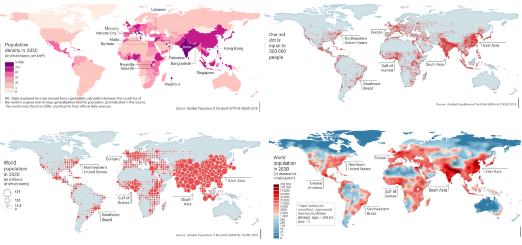
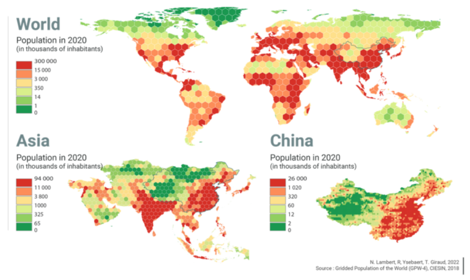
For instance, in a population density map, keeping it simple with just two or three colors and avoiding unnecessary details makes the data far more readable.
Ask yourself if every element is necessary.
If it isn’t, remove it.
Use generalization to simplify overly complex features like roads and rivers, especially on small-scale maps.
In interactive maps, allow users to toggle layers so they control how much complexity they want to see.

4. Contrast and Legibility
Contrast is critical for making different map elements distinguishable.
Without good contrast, elements like roads, rivers, or city boundaries can blend together, reducing the map’s usability. Legibility refers to how easy it is to read text and interpret symbols on the map.
One time, I used light-colored roads on a pale yellow background — big mistake.
The roads were nearly invisible. Since then, I always ensure there’s enough contrast to make map features stand out clearly.
To improve contrast and legibility: use contrasting colors to ensure text and symbols are distinct from the background, choose readable fonts and avoid overly decorative or small text, and select symbols that are easily identifiable and consistent in meaning.
You don’t need to be a color composition expert for map design purposes, but even a basic one will help you in your mapmaking journey.

5. Alignment and Consistency
Alignment ensures that your map looks neat and professional, with all elements properly arranged.
Consistency in the use of symbols, fonts, and colors helps users quickly understand and interpret the map without confusion.
For example, on a series of maps I worked on for a government project, I used the same font and color scheme throughout.
This consistency allowed users to switch between maps without having to re-learn what each symbol or color represented.
Best practices:
- align your legend, title, and scale bar horizontally or vertically for a clean look;
- apply the same fonts, colors, and symbols across the map and across any series of maps; and
- check that all elements work together as a cohesive design.
Key Map Design Concepts (Deep Dives)
The principles above give you a strong foundation.
But several key concepts deserve a deeper look — each one shapes how your final map looks, reads, and performs. Think of this section as your map design roadmap, with each concept linking to a dedicated guide where you can go deeper.
Map Scale
Map Scale controls how much of the world fits on your map and how much detail you can show.
A large-scale map like 1:10,000 zooms in close, letting you display individual buildings, street names, and park boundaries. A small-scale map like 1:1,000,000 pulls back to show entire regions, but forces you to drop minor details that would clutter the view.
Every other design decision — symbol size, label density, generalization level — flows directly from the scale you choose.
Map Projection
Map Projection is how you translate the Earth’s curved, three-dimensional surface onto a flat two-dimensional plane.
No projection does this perfectly — every one involves a trade-off between preserving area, shape, distance, or direction. A Mercator projection keeps angles accurate, making it ideal for navigation, but inflates landmasses near the poles.
An Equal-Area projection keeps landmass sizes proportional, making it better for thematic maps comparing regions.
Choosing the wrong projection for your purpose can silently mislead your reader without either of you realizing it.
Map Symbolization
Map Symbol and Symbolization is the visual language of your map.
You encode geographic features using three basic building blocks: points (for discrete locations like cities or sample sites), lines (for linear features like roads or rivers), and polygons (for area features like land cover or administrative boundaries).
Beyond geometry, you control symbol color, size, shape, and texture to convey meaning.
For example, a larger circle might represent a higher population, while a darker shade might indicate a greater concentration of an environmental variable.
Getting symbolization right means your reader can decode the map intuitively, without constantly referencing the legend.
Map Generalization
Map Generalization is what keeps your map readable as the scale decreases.
In practice, you can’t show every detail of the real world at every scale — minor roads, small lakes, and fine coastline contours all become noise at smaller scales.
Generalization gives you controlled ways to handle this: you might simplify a winding river into a smoother curve, merge small adjacent polygons into a single class, or remove features below a certain size threshold entirely.
The goal is to preserve the geographic truth that matters for the map’s purpose while eliminating the detail that would obscure it.
Map Types
Map Types refers to the different cartographic formats designed to show different kinds of data.
A choropleth map uses color gradients to show statistical values across geographic areas, like income levels by county. A dot density map places individual dots to represent a quantity, giving a sense of spatial distribution. A proportional symbol map scales point symbols — circles, squares, or icons — to represent magnitude at specific locations.
Choosing the right map type for your data is as important as any visual decision.
The wrong type can create a misleading picture even when the underlying data is perfectly accurate.
Map Elements
Map Elements are the supporting components of map design that give your map context and make it self-explanatory.
The core set includes a title (what the map shows), a legend (what the symbols mean), a scale bar (the relationship between map distance and real-world distance), a north arrow (orientation), and source attribution (where the data came from).
Some maps also benefit from a graticule — the grid of latitude and longitude lines — or an inset map showing the area’s location in a broader context.
Each element earns its place by helping the reader interpret the map. If an element doesn’t serve that purpose, leave it out.
Map Typography
Map Typography shapes how readable and authoritative your map feels.
Font choice, size, weight, style, and placement all carry meaning. Serif fonts often feel traditional and are common on reference maps, while sans-serif fonts read cleanly at small sizes and suit modern thematic designs.
Labels for water features are traditionally italicized; labels for political boundaries are often spaced out in uppercase.
Placement matters just as much as style — a label placed ambiguously between two features forces the reader to guess which one it names.
Good map typography is invisible: the reader focuses on the data, not on deciphering the text.
Designing for Different Media
Maps aren’t just for print anymore.
They’re viewed on everything from high-resolution computer screens to mobile devices, and each medium has its own set of design challenges.
1. Print Maps
Print maps come with their own set of considerations, especially in terms of resolution and color modes. Since users can’t interact with a printed map, all the necessary information needs to be displayed clearly in a single, static layout.
When I designed a map for a guidebook, I had to think carefully about resolution and how the colors would appear on paper. What looked vibrant on a screen sometimes turned out too dull in print, so I adjusted the color palette and ensured the map was legible at the printed size.
Key considerations for print maps:
- design at a high resolution (300 DPI or higher) to avoid pixelation;
- use CMYK color mode since RGB colors can shift when printed; and
- make sure text and symbols are large enough to be readable on the physical page.
2. Digital and Web Maps
Digital and web maps offer more flexibility than print maps, allowing for interactive elements like zooming, panning, and clickable layers. However, designing for the web means considering screen resolution, responsiveness, and user interactivity.
One of the biggest challenges I’ve faced with web maps is ensuring they’re responsive — meaning they look good and function well on different screen sizes.
I designed an interactive city map for a tourism website, and it was crucial that users could zoom in to see detailed points of interest while maintaining an overall clean and accessible layout.
Key considerations:
- design maps to adjust and display correctly on different screen sizes;
- include interactive features like clickable layers, zooming, and panning; and
- optimize map layers so the map loads quickly, especially for users with slower internet connections.
3. Mobile Maps
Mobile maps require a simplified design because of the small screen size. Elements like text, buttons, and symbols need to be larger and more spaced out, and you need to ensure that the map is easy to navigate on a touchscreen.
When I worked on a mobile map for an app, I focused on increasing the size of all interactive elements, like buttons and markers. I also simplified the map design to avoid overcrowding the screen, which made it much easier to use.
Key considerations:
- strip the design down to essential elements;
- make buttons and map features large enough to tap easily on a touchscreen; and
- use larger text to ensure readability, avoiding long labels that may get cut off.
4. Interactive and Web Maps
Web and interactive maps add another dimension to map design. With the ability to zoom, click, and filter data, these maps require a different design approach from static print maps.
For a project with a tourism website, I designed an interactive map that allowed users to filter restaurants, parks, and museums based on their preferences. This kind of interactivity made the map more engaging, but I had to ensure the interface was intuitive enough for a wide range of users.
Design tips for interactive maps:
- allow users to toggle between different layers to avoid overwhelming them with too much information at once;
- provide a search feature so users can easily find specific places; and
- ensure zoom and pan controls are easy to use with clear icons for toggling layers.
Common Map Design Mistakes
Now let’s consider some common map design mistakes and how to avoid them. Even the most data-rich maps can fail if poorly designed.
Cluttered Legends and Overuse of Symbols
In some thematic maps, the legend can become so complex that it’s nearly impossible to read.
Overusing colors, symbols, and layers can make the map overwhelming.
The fix:
- simplify the legend,
- use fewer categories, and
- make sure each symbol and color is easily distinguishable.
Remember: A cluttered legend leads to user frustration.
Poor Contrast and Inadequate Color Choices
Maps where dark roads sit on a dark background make it almost impossible to distinguish important features.
Maps with insufficient contrast are difficult to read, especially for users with visual impairments.
The fix:
- use contrasting colors for different features,
- test the map for readability under various lighting conditions, and
- consider colorblind-friendly palettes.
Overcomplicated Text Labels
This one is on map typography.
Too many text labels, overlapping and cluttering the view, can confuse the reader and detract from the map’s overall effectiveness.
The fix:
- label only the most important features,
- ensure labels don’t overlap, and
- use text hierarchy and size variation to distinguish between primary and secondary labels.
Wrap Up
Map design is a core aspect of cartography and GIS, and it goes far beyond aesthetics. Every decision you make — from projection to color palette to label placement — shapes how well your map communicates.
Start with purpose and audience. Build in clarity through visual hierarchy and contrast. Keep the design media-appropriate. And always ask whether each element earns its place on the map.
From my perspective, the maps that stick with people are the ones that make complex spatial data feel effortless to read. That’s the goal every time you open QGIS, ArcGIS, or any other mapping tool.
Happy mapping!
FAQ
What is the difference between map design and cartography?
Cartography is the broader discipline of making maps, including data collection, geographic analysis, and projection science. Map design is a subset of cartography that focuses specifically on the visual and communicative choices — symbols, colors, typography, and layout — that make a map easy to read and understand.
What software is best for map design?
The right tool depends on your workflow and budget. QGIS is a powerful free option with strong cartographic capabilities. ArcGIS Pro offers advanced design features for professional environments. For web maps, tools like Mapbox and Leaflet give you precise control over interactive design. Based on my experience, QGIS is an excellent starting point for most GIS professionals.
How do I choose the right color scheme for my map?
Start by considering the type of data you’re mapping. Sequential color schemes (light to dark) work well for continuous data like population density. Diverging schemes highlight values above and below a midpoint, useful for temperature or change maps. Qualitative schemes use distinct hues for categorical data. Always check your palette for colorblind accessibility using tools like ColorBrewer.
What is cartographic generalization and when should I use it?
Cartographic generalization is the process of simplifying map features to maintain legibility as the scale decreases. You apply it when a smaller scale makes minor features unreadable, when including every detail creates visual clutter, or when users can’t distinguish between different map elements. It’s a normal and necessary part of designing maps for broader geographic extents.
What are the essential elements every map should include?
At minimum, a complete map includes a title, legend, scale bar, north arrow, and source attribution. Depending on the purpose, you may also add a graticule (coordinate grid), inset map, or date of data. Each element serves a function — don’t include them just for show, but don’t leave out any that the reader needs to interpret the map accurately.
How does map media affect design decisions?
The medium shapes nearly every design decision. Print maps require high resolution (300 DPI), CMYK colors, and a fully self-contained layout since users can’t interact with them. Web maps can support interactivity and layered data but need responsive design for different screen sizes. Mobile maps demand simplified layouts, larger touch targets, and minimal labeling to work on small screens.
Join the Community
What’s the trickiest map design challenge you’ve faced? Drop your experience in the comments — whether it was wrestling with projection choices, nailing a color scheme, or getting labels to stop overlapping. The Better Mapmaker community learns best when we share what’s worked (and what hasn’t).
If this guide helped you, share it with a colleague who’s just getting started with GIS. And if there’s a specific map design topic you’d like us to cover next, let us know below.
Happy mapping!