Did you know that the symbols on a map are more than just simple illustrations?
These geographic symbols are the key to unlocking a map’s full potential, allowing you to grasp complex information about the world around you quickly.
Map symbols are vital in cartography, transforming intricate data into an easy-to-understand visual language. In this article, you’ll understand what map symbols are, explore their types and functions, and see how you can design them effectively.
Let’s dive in!
Contents
What Are Map Symbols?
Map symbols are one of the key components of a map.
They represent objects such as features, phenomena, or concepts that the map intends to convey.
More specifically, map symbols are signs used to represent real-world features.
These features could be natural — like rivers and mountains — or man-made, like airports or train stations.
Map symbols also depict abstract phenomena, such as the number of COVID-19 cases in a particular area or refugee movements during a conflict. Topographic maps rely heavily on symbols to represent elevation and terrain features, making them essential tools for outdoor navigation.
Symbols are one of the primary sources of information for map readers.
Although no universal standard exists for symbology across all map types — especially thematic maps — various conventions are widely followed in certain map classes. Using blue for water or contour lines for elevation are two of the most recognized examples.

The Role of Map Symbols
Map symbols serve two interconnected functions.
First, they simplify the process for mapmakers to depict mapped objects. Second, they help users read and understand the map more easily.
Mapmakers apply cartographic judgment — particularly in map symbolization — to select and design symbols that match the purpose or intent of the map.
The symbols, together with a clear map legend, should be easy for any reader to interpret without prior instruction.
Maps must be designed to allow users to read and understand them as quickly as possible. This approach frees map users to spend more time analyzing and interpreting the content rather than decoding what they’re looking at.
Beyond readability, map symbols achieve several specific objectives.
They indicate the presence and distribution of geographical phenomena.
They display attribute information, which can include values, levels, quantities, or statistics of an object.
They show visual hierarchy by emphasizing more important information over secondary details. They enhance the aesthetic appeal of the map. And they can evoke specific reactions in readers — such as a sense of danger on a disaster vulnerability map.
How to Read Map Symbols
If you’ve ever opened a map and felt unsure where to start, you’re not alone. Reading map symbols is a skill and like any skill, it gets easier once you know the basic steps.
1. Start with the legend
The legend (sometimes called the map key) is your decoder. It lists every symbol used on the map and tells you what each one means. Before you try to interpret anything on the map itself, spend a moment with the legend. Think of it as reading the instructions before playing a new game.
2. Identify the symbol type
Once you know the legend, look at the map and ask yourself: is this symbol a point, a line, or an area? A small dot or icon is a point — it marks a specific location. A line runs between two places — roads, rivers, and borders are all line symbols. A colored or shaded region is an area symbol — it tells you something about that whole zone, like land cover or population density.
3. Pay attention to color
Color is one of the fastest ways to read a map. Blue almost always means water. Green typically indicates vegetation or parks. Red often flags something important or warns of danger. These conventions aren’t universal across every map type, but they hold true often enough to be a useful starting point.
4. Look at size and shape for extra meaning
A larger symbol usually means something more significant — a bigger city, a higher mountain, a major road. Different shapes signal different feature types: a triangle might mark a peak, a square a building, a circle a settlement. When in doubt, check these against the legend.
5. Read the title and scale
The map title tells you what the map is about and often what time period it covers. The scale tells you how distance on the map relates to real-world distance — essential context for interpreting how far apart features actually are.
6. Take your time with unfamiliar symbols
Not every symbol is immediately obvious, especially on technical maps like topographic map or nautical charts. These use specialist conventions — contour lines for elevation, depth soundings for water, specific icons for navigational hazards. When you encounter symbols you don’t recognize, the legend is always your first stop.
Reading map symbols gets more intuitive the more maps you work with. Start with simple reference maps, then move to thematic and topographic maps as your confidence grows.
Types of Map Symbols and Examples
Map symbols can be categorized based on three factors: their shape or dimension, their data characteristics, and their depiction method.
Map Symbols Based on Shape
Based on shape or dimension, map symbols divide into three types: point symbols, line symbols, and area symbols. The right type to use depends on the map’s scale and the nature of the feature being represented.
Point Symbols
Point symbols indicate locations on a map. They can also differentiate types of objects (qualitative data) or indicate values (quantitative data). Common examples include cities, elevation points, ports, and airports.
Line Symbols
Line symbols represent linear features such as rivers, roads, coastlines, and borders. They also depict routes or movements — for instance, arrows showing migration flows or trade routes.
Area Symbols
Area symbols represent regions with specific characteristics — administrative areas like villages, districts, counties, and provinces, as well as land cover types like forests, wetlands, or urban zones.
The appropriate symbol type is closely tied to map scale. A river shown as a line on a small-scale map may be represented as an area polygon on a large-scale map. Similarly, a city shown as a point at regional scale may appear as a polygon at city scale.
Map Symbols Based on Data Characteristics
Data characteristics divide map symbols into two broad categories: qualitative symbols and quantitative symbols.
Qualitative Symbols
Qualitative symbols represent data that describes type or category rather than quantity. These break down further into nominal and ordinal data.
Nominal (Categorical) Data represents classification data where each class has equal standing and cannot be mathematically compared to others. Land use types are a classic example — residential, agricultural, and industrial zones are different categories, not ranked values.
Ordinal Data introduces ranking or order. The distinction between classes is qualitative — small to large, low to high — but the differences cannot be expressed as precise numerical quantities.
Quantitative Symbols
Quantitative symbols represent numerical data. These divide into interval and ratio data.
Interval Data uses numerical values where the differences between measurements are meaningful, but there is no true zero point. Temperature in Celsius is the standard example: 0°C doesn’t mean the absence of temperature, and you can’t say 20°C is twice as warm as 10°C.
Ratio Data shares the characteristics of interval data but includes a meaningful zero point. The zero is absolute with no negative values, which allows true comparative statements — 40 cm is genuinely twice the length of 20 cm.
Map Symbols Based on Depiction Method
Based on how they look, map symbols divide into abstract symbols and pictorial symbols.
Abstract Symbols
Abstract symbols do not resemble the actual appearance of the features they represent. They typically depict concepts or phenomena — vegetation density, population distribution, or pollution levels — where no obvious visual equivalent exists.
Pictorial Symbols
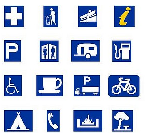
Pictorial symbols are designed to resemble the objects they represent. A bus icon for a bus terminal or an airplane icon for an airport are familiar examples. Pictorial symbols lower the learning curve for map reading and are especially well-suited to maps for children or the general public.
Visual Variables in Map Symbols
Visual variables — size, shape, color, orientation, texture, and pattern — are the properties that make symbols distinct and meaningful. At the symbol level, here’s the short version of what each one does.
Size communicates significance or quantity. A large star for a capital city reads differently from a small dot for a village — the size difference itself carries meaning.
Shape differentiates feature types: squares for man-made structures, triangles for peaks, circles for settlements. Shape is especially useful for distinguishing categories without relying on color alone.
Color is the most immediately noticed variable — blue for water, green for vegetation, red for warnings — and can encode both category and magnitude, though it must be chosen with colorblind accessibility in mind.
Pattern represents land use or terrain where solid fills would merge together, and helps maintain readability in grayscale.
Understanding these variables prevents common misreadings, like confusing elevation contours with forest density patterns on a topographic map.
How to Design Symbols for a Map
Map design is a long thought process, not just a visual choice.
It starts with understanding your map’s purpose and audience — whether you’re building a city planning map, a navigation guide, or a public-facing thematic map, that context shapes every decision that follows.
From there, the work is about simplification: distilling complex geographic data into symbols that are immediately recognizable without requiring the reader to memorize a legend.
Each symbol should earn its place on the map.
The full design process — how to use visual variables deliberately, test for clarity and usability, adapt symbols for digital and interactive media, and follow cartographic conventions — is covered in depth in our guide on map symbolization.
If you’re ready to move from understanding symbols to building a complete symbolization system, that’s where to go next.
Wrap Up
Map symbols are the foundation of how users interact with and understand any map you create. By mastering the range of symbol types — point, line, and area; qualitative and quantitative; abstract and pictorial — you’ll be able to read any map more confidently and make more deliberate choices when building your own.
Every symbol you choose plays a part in telling the story of the landscape. Once you’re clear on what symbols are and how they’re classified, the next step is learning how to design and assign them systematically — and that’s exactly what map symbolization is about.
Happy mapping!
FAQ
What is a map symbol?
A map symbol is a sign used on a map to represent a real-world feature, phenomenon, or concept. Features can be natural (rivers, mountains), man-made (airports, roads), or abstract (population density, disease spread). Symbols make it possible to communicate complex geographic information in a compact, readable visual form.
What are the three types of map symbols based on shape?
The three shape-based types are point symbols, line symbols, and area symbols. Point symbols represent discrete locations; line symbols represent linear features like roads or rivers; area symbols represent regions with specific characteristics like land cover or administrative boundaries. Which type to use depends on the feature being mapped and the map’s scale.
What is the difference between abstract and pictorial map symbols?
Pictorial symbols resemble the objects they represent — an airplane icon for an airport, a tent icon for a campsite. Abstract symbols bear no visual resemblance to their referents and instead use shape, color, or pattern to encode meaning — contour lines for elevation, for example. Pictorial symbols are easier for general audiences to read without training; abstract symbols are more flexible and precise for technical cartography.
What is the difference between qualitative and quantitative map symbols?
Qualitative symbols represent categories or types — land use classes, road types, or administrative regions — without implying numerical order or magnitude. Quantitative symbols encode numerical values, either as intervals (where differences are meaningful but there’s no true zero) or ratios (where a true zero exists and absolute comparisons are valid). Choosing the wrong symbol type for your data is one of the most common cartographic errors.
Why are there no universal map symbol standards?
Universal standardization is difficult because map purpose, audience, and medium vary enormously. A topographic map, a nautical chart, and a thematic population map each serve different readers with different needs. Some conventions have emerged for specific map classes — such as contour lines for elevation or blue for water — but thematic maps in particular require custom symbolization tailored to the specific dataset being communicated.
What is the relationship between map symbols and map symbolization?
Map symbols are the individual visual units — the point, line, or area markers placed on the map. Map symbolization is the broader design process of selecting, styling, and assigning those symbols to geographic data. Think of symbols as the words and symbolization as the grammar. For a full treatment of the symbolization process, visual variables as a design system, and techniques like choropleth and dot density mapping, see our guide on map symbolization.
Join the Community
What’s the most interesting or challenging symbol design decision you’ve faced on a project? Whether it was finding the right pictorial symbol for an unusual feature, handling a dense urban area, or designing for a non-specialist audience — share it in the comments below.
If this guide was useful, pass it along to a colleague who’s building their first map. And if there’s a specific symbol type or design challenge you’d like us to cover next, let us know.
Happy mapping!