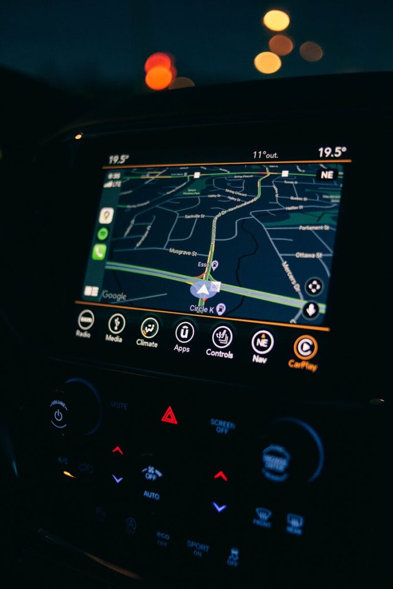
Have you ever wondered why the map a ship captain uses looks nothing like the one on your phone?
That difference has a name: the navigational map.
A navigational map — also called a chart in cartographic terminology — is a purpose-built map designed specifically to support safe movement across land, sea, or air.
Unlike a general reference map, which shows you where things are, a navigational map tells you how to move through space without hitting something that could kill you. That distinction matters more than it might seem.
In GIS and cartography, navigational maps occupy their own category alongside topographic and thematic maps. They pull elements from both — blending terrain data, reference features, and thematic overlays — but they organize that information around one core question: what does a navigator need to know right now?
This article breaks down the definition, function, and types of navigational maps, and explains why they look and behave so differently from other map formats you work with every day.
Contents
The term “navigational map” is deceptively broad, so let’s pin it down before going further.
According to the International Cartographic Association (ICA, 1977), a navigational map or chart is a map designed and produced specifically for the purpose of navigation — whether by land, sea, or air. The word “chart” in cartography specifically refers to this category, which is why you’ll hear sailors say “chart” rather than “map” when referring to what they use at sea.
Think of it as a map with a job description.
A road map tells you what roads exist. A navigational chart tells you which route is safe, what hazards lie ahead, and exactly where you are at any given moment relative to those hazards. The emphasis shifts from information display to decision support.
Cartographers typically organize maps into three broad categories: topographic maps, thematic maps, and navigational maps (charts).
Topographic maps show the physical surface of the earth: elevation, landforms, rivers, and land cover. Thematic maps communicate a specific dataset, like population density or rainfall.
Navigational maps occupy a hybrid position: they incorporate topographic and thematic data, but they restructure that information around the needs of someone actively moving through a space.
In practice, a nautical chart contains depth soundings (thematic data), coastline geometry (topographic data), and hazard markers (navigational data) — all in a single document.
That layered purpose is what sets navigational maps apart.

This is the question I hear most often from GIS students encountering chart data for the first time, and it’s the right question to ask. Navigational maps differ from other map types in three fundamental ways.
Emphasis on risk over completeness.
A topographic map treats all features as equally worth showing: a mountain, a river, a road, and a building all get represented at their appropriate scale.
A navigational map filters the world through the lens of risk. Features that pose no hazard to a navigator get reduced or removed. Features that could cause an incident (a shallow reef, a radio tower, a restricted airspace) get amplified.
The map isn’t trying to show you everything; it’s trying to show you what matters for safe movement.
A specialized information layer found nowhere else.
Navigational maps carry data that simply doesn’t exist in standard topographic or thematic products.
Depending on the type, this layer includes lighthouse positions, compass roses, tidal notes, magnetic variation annotations, airspace boundaries, and radio frequencies.
None of this appears on a general-purpose map because none of it is relevant to someone who isn’t navigating.
It’s information built specifically for decision-making in motion.
Like topographic maps, navigational charts are almost always produced by official government mapping agencies:
- national hydrographic offices for nautical charts,
- civil aviation authorities for aeronautical charts, and
- national survey agencies for land navigation maps.
These agencies carry the legal authority to certify that a chart is accurate enough to navigate by — a responsibility no commercial map provider takes on.
When a navigator uses an official chart, they’re using a legally certified safety instrument, not just a dataset.
Navigational maps divide neatly into three types based on the domain they serve.
Each type carries its own symbology, standards, and production conventions — and each has been optimized over decades for the specific hazards its users face.
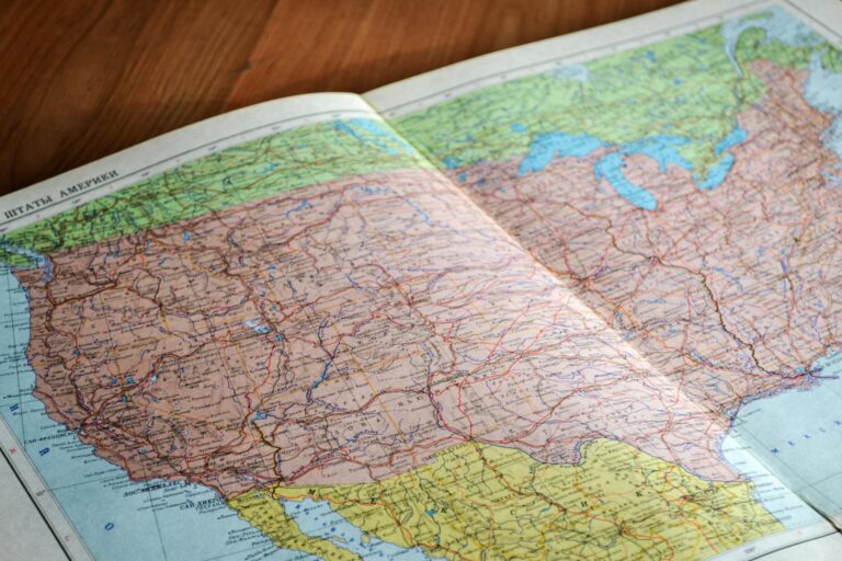
Land navigation relies on a detailed picture of the earth’s surface: elevation, slope, drainage patterns, vegetation cover, and built features.
A navigator on foot or in a vehicle needs to understand terrain in order to plan a route, assess trafficability, or identify landmarks.
As a result, land navigation maps are essentially topographic maps.
In most cases, dedicated “land navigational charts” are not produced separately. The standard topographic map already meets the requirement.
From my experience working with field teams in forestry and conservation contexts, a well-scaled topographic map at 1:50,000 or 1:25,000 is the default tool for overland navigation, and it does the job without a separate product category.
Most national mapping agencies publish topographic maps at multiple scales.
Common options include 1:250,000 for broad coverage and 1:50,000 or 1:25,000 for detailed fieldwork. Both scales serve as primary navigational references for land movement — the right choice depends on your operational needs.
A quick note on scale: For land navigation, scale selection matters more than for other map types. A 1:250,000 map shows you the big picture but loses the fine terrain detail you need when moving through complex ground. A 1:50,000 map trades breadth for precision. Choose based on your navigation task, not convenience.

Sources/Usage: Public Domain. View Media Details
Nautical Charts
Nautical charts are the most technically specialized category of navigational map.
They carry information that exists nowhere else: water depth (bathymetry), seafloor composition, current patterns, tidal ranges, magnetic anomalies, and the precise positions of every navigation aid in a given area — from buoys to lighthouses to harbor infrastructure.
Think of a nautical chart as a risk map for the ocean surface and the water column beneath it.
Everything on the chart is there because it either helps you navigate or could stop you from doing so permanently. The coastline appears, but only its hazardous features — headlands, reefs, submerged rocks — receive full treatment. An unremarkable stretch of beach may be reduced to a simple line.
Most countries operate a national hydrographic office responsible for producing and maintaining their nautical charts.
These offices update charts continuously through hydrographic surveys, with higher-frequency updates for areas where conditions change rapidly — such as river deltas, active ports, and regions with significant sediment transport.
International Symbology Standards
Nautical charts follow international symbology standards adopted by all maritime nations. One widely recognized convention: when a chart is produced in color, special navigational information is shown in purple (violet).
Depth zones are shaded in graduated blues and white. This standardization means a navigator trained on Indonesian charts can read a chart from Norway or Brazil with no retraining required.
From what I’ve observed, this level of standardization is actually rarer in cartography than you’d expect. Most map types allow significant national variation.
The international consistency of nautical charts reflects the life-safety stakes of maritime navigation.

Aeronautical Charts
Aeronautical charts answer a different set of questions than either land or nautical maps.
An aircraft navigator needs to know: What terrain will I encounter at my planned altitude? Where are the obstacles that could intercept my flight path? What airspace zones apply here, and what are their radio frequencies? Where can I land?
To answer those questions, aeronautical charts show terrain primarily through hill shading and spot heights rather than contour lines. That is because a pilot reading a chart at altitude needs to grasp terrain quickly, not calculate exact elevations.
Spot heights for prominent high points are displayed as large black numbers, giving the pilot an immediate sense of the highest obstacles in any sector.
Cities appear on aeronautical charts not as detailed urban layouts but as filled circles or shaped symbols, sized by population. Their purpose is to serve as visual landmarks from altitude and to indicate potential landing zones.
Hazard Marking
Man-made obstacles that present hazards to low-flying aircraft receive their own symbology.
Towers and chimneys are commonly marked with purple triangles. Any structure tall enough to intersect a normal flight path gets represented, regardless of whether it would appear on a topographic map.
Aeronautical charts are one of the few cartographic products that treat height as a primary hazard variable rather than an attribute.
Aeronautical charts are typically produced jointly by a national air force and a civil aviation authority, reflecting the dual-use nature of airspace.
All altitude values on aeronautical charts are expressed in meters above sea level, providing a consistent vertical reference across the entire chart.
Read how to read an aeronautical chart here.
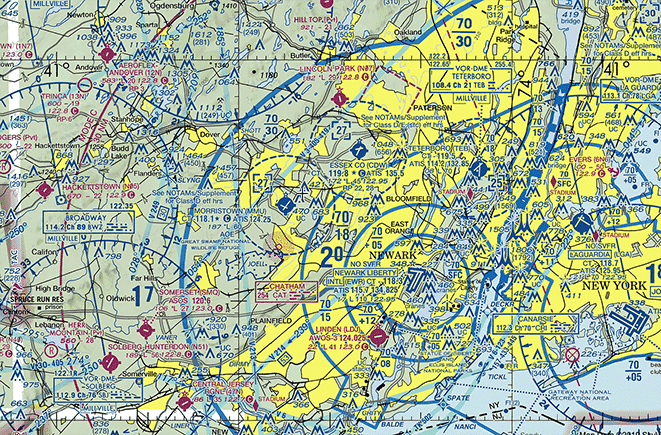
Credit: Ryan Ferguson
Navigational map data is increasingly available in digital formats, and integrating it into a GIS workflow is more straightforward than it used to be. Here’s how to get started.
Step 1: Identify the right data source for your domain
For nautical data, the NOAA Electronic Navigational Chart (ENC) collection and the British Admiralty (UKHO) offer open or low-cost digital products in S-57 and S-63 formats. Your national hydrographic office is also a primary source — most publish ENCs through official portals.
For aeronautical data, national civil aviation authorities publish digital ARINC-424 and GeoJSON datasets. The OpenAIP platform aggregates aeronautical data globally in GIS-compatible formats.
For land navigation, topographic data is typically available through your national mapping agency’s geoportal at a range of scales.
Step 2: Understand the format
Nautical charts use the IHO S-57 standard, which stores features as vector objects with attribute tables. You can open S-57 files in QGIS using the built-in OGR driver — no plugin required.
Each feature type (depths, coastlines, buoys) is stored as a separate layer, so you’ll need to manage layer visibility carefully.
Aeronautical data in GeoJSON or KML format loads directly into QGIS or ArcGIS. The main challenge is interpreting the attribute schema, which uses ICAO coding conventions that aren’t self-explanatory. Keep the relevant chart supplement open alongside your GIS session.
Step 3: Apply domain-appropriate symbology
Don’t apply standard GIS symbology to navigational chart data.
The IHO and ICAO have established color and symbol conventions for a reason — using them keeps your output readable to anyone trained in the domain.
QGIS has community-developed S-57 style files available through the plugin repository that apply correct nautical symbology automatically.
Step 4: Respect the currency of the data
Navigational chart data has a shelf life. Conditions change: ports expand, reefs shift, airspace boundaries get redrawn. Before using navigational chart data for any operational purpose, verify the edition date and check whether a Notice to Mariners (NtM) or NOTAM update applies to your area of interest.
Step 5: Cross-reference with your base layers
Navigational chart data rarely aligns perfectly with topographic or satellite imagery layers due to different datums, survey epochs, and generalization levels. Always cross-reference your chart data against a recent satellite imagery basemap before drawing conclusions about spatial relationships.
FAQ
What is the difference between a navigational map and a chart?
In everyday English, the two terms are often used interchangeably, but in cartographic practice they carry a specific distinction. “Chart” technically refers to a navigational map — particularly one used for maritime or aviation navigation. So all charts are navigational maps, but not all navigational maps use the word “chart.” A topographic map used for land navigation, for instance, is a navigational map but not typically called a chart.
Can I use a regular GIS map for navigation?
Technically yes, but it’s not recommended for marine or aviation contexts. A standard GIS map lacks the specialized hazard layers, depth soundings, obstacle data, and regulatory information that make navigational charts safe to use. For land navigation, a well-scaled topographic map usually suffices. For anything involving water or airspace, use the official chart products for that domain.
Why do navigational maps need to be produced by government agencies?
The short answer is liability and authority. A navigator who follows a chart and runs aground, or a pilot who follows a chart and strikes a tower, needs to know that the chart they used met a certifiable accuracy standard. Government agencies carry the institutional and legal authority to certify that standard. Private GIS products, however accurate, don’t carry that certification — which is why official nautical charts are legally required instruments for maritime navigation in most jurisdictions.
What software can I use to open nautical chart data?
QGIS handles S-57 nautical chart files natively through its OGR driver, making it the most accessible option for GIS professionals. ArcGIS Pro also supports S-57 via the Maritime Charts extension. OpenCPN is a dedicated chart-plotter application designed specifically for nautical S-57 data and is free to use. For aeronautical data, QGIS and ArcGIS both handle GeoJSON and KML formats without additional configuration.
How often are navigational charts updated?
It varies by domain and by area. Nautical charts in high-traffic or dynamically changing areas (active ports, river mouths, dredged channels) may be updated multiple times per year. Aeronautical charts are typically updated on a 28-day AIRAC cycle for digital products, with some chart editions published quarterly or annually for print. Land navigation maps (topographic) are updated less frequently — often on a multi-year cycle — unless significant terrain changes have occurred.
What is the IHO S-57 standard?
IHO S-57 is the international standard developed by the International Hydrographic Organization for the encoding of digital hydrographic data. It defines how nautical chart features — depths, coastlines, navigation aids, and hazards — are structured, attributed, and stored in a digital format. Most national hydrographic offices publish their electronic navigational charts (ENCs) in S-57 format, ensuring compatibility across chart-plotter systems worldwide.
Wrap Up
Navigational maps are one of the oldest and most functionally demanding categories in cartography.
They carry a different kind of weight than other maps — when a nautical chart is wrong, ships run aground; when an aeronautical chart is wrong, planes go down. That high-stakes context shapes everything about how they’re designed, produced, and maintained.
For GIS professionals, understanding navigational maps means recognizing both their power and their constraints.
They’re not general-purpose tools. They’re precision instruments built for a specific task, with internationally standardized symbology, government-certified accuracy, and update cycles driven by real-world conditions.
Knowing how to work with that data — and when to use it versus a standard GIS layer — makes you a significantly more versatile analyst.
Whether you’re integrating S-57 nautical data into a coastal management project, visualizing airspace boundaries for a drone operations study, or simply deepening your cartographic vocabulary, navigational maps are worth understanding at this level of detail.
Happy mapping!
Start Mapping Smarter
Have you worked with nautical or aeronautical chart data in your GIS projects? Drop a comment below and share what tools or workflows you’ve found most useful. If you’re just getting started with navigational map data in QGIS, let me know in the comments — I’d love to put together a step-by-step tutorial based on what you actually need.
And if you found this guide useful, consider sharing it with a colleague who’s still fuzzy on the difference between a map and a chart. It comes up more often than you’d think.