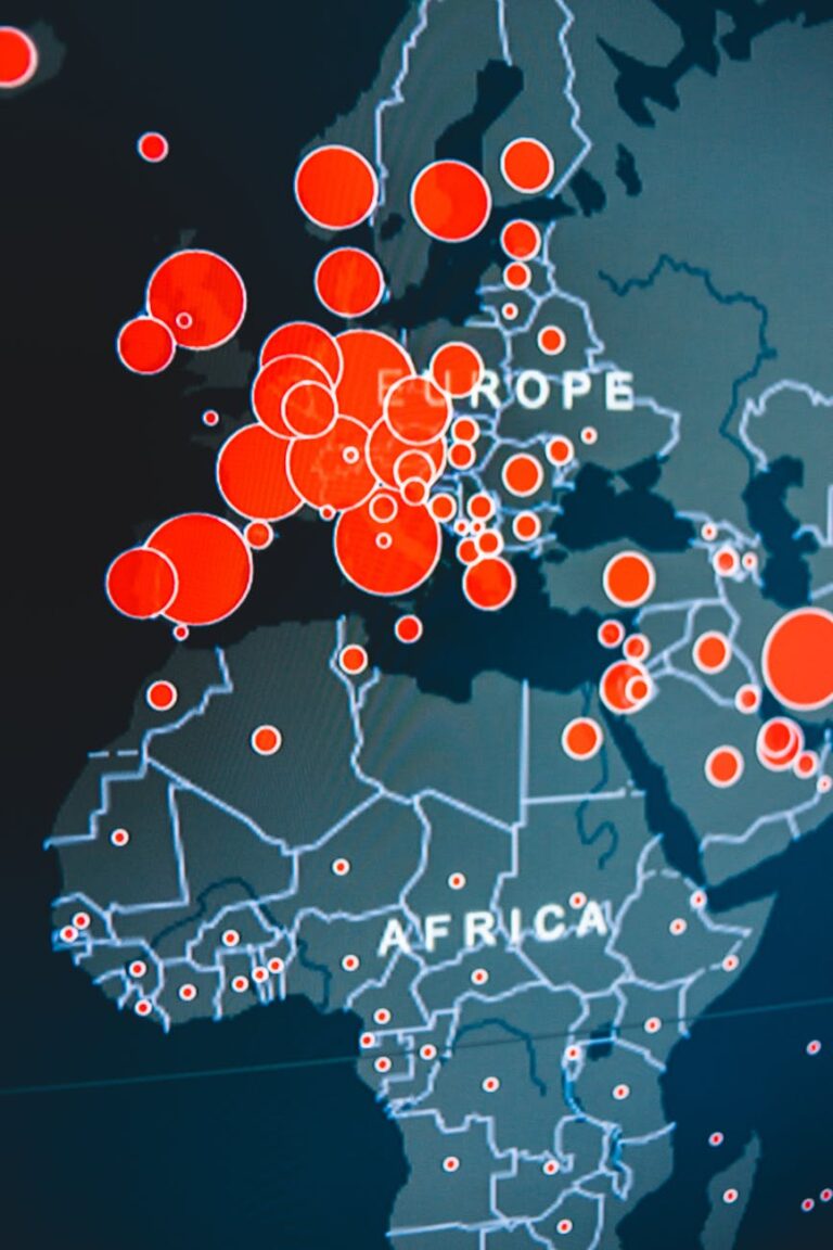
Did you know that the way data is represented on a map can dramatically change how you perceive and understand information?
A thematic map focuses on specific themes or topics, such as population density or climate patterns, by using various techniques to visualize data across geographic areas.
Thematic maps are powerful tools that reveal hidden patterns and trends, helping you make sense of complex data in a clear and meaningful way. These maps play a crucial role in cartography and are widely used in geospatial analysis to inform decision-making across various fields.
In this article, you’ll dive into what a thematic map is, why it’s important, and how understanding these maps can enhance your ability to interpret and analyze data effectively.
Let’s get started.
Contents
- 1 What is a Thematic Map?
- 2 Understanding Thematic Maps
- 3 Key Differences Between Thematic Maps and Reference Maps
- 4 General vs Thematic Maps
- 5 Benefits of Thematic Maps
- 6 Characteristics of Thematic Maps
- 7 Types of Thematic Maps
- 7.1 Choropleth Map
- 7.2 Point Distribution Map (Dot Map)
- 7.3 Proportional Symbol Map
- 7.4 Isoline (Isarithmic) Map
- 7.5 Flow Map
- 7.6 Dasymetric Map
- 7.7 Prism Map
- 7.8 Bivariate or Multivariate Map
- 7.9 Heat Map
- 7.10 Cartogram
- 7.11 Dot Density Map
- 7.12 Grid Map
- 7.13 Time-Series Map
- 7.14 Climograph Map
- 7.15 Infographic Map
- 7.16 Interactive Map
- 8 Case Study: Use of Thematic Maps in Various Real-World Projects
- 9 Creating Effective Thematic Maps
- 10 Challenges and Considerations
- 11 Final Reflection on Thematic Maps
What is a Thematic Map?
A thematic map is perhaps the most commonly encountered map in our daily lives. Unlike reference maps or navigational maps, thematic maps serve a different purpose. So, what exactly is a thematic map?
A thematic map focuses on a specific theme by representing qualitative or quantitative information about a particular object, feature, or phenomenon.
It displays this information using various techniques such as choropleth maps, isoline maps, dasymetric maps, or proportional symbol maps.
Examples of thematic maps include population density maps, land use maps, or rainfall maps.
Understanding Thematic Maps
Thematic maps highlight specific themes such as population or climate.
Unlike general reference maps, which show a variety of features like roads, cities, and landmarks, thematic maps focus on particular data related to a specific subject. For instance, thematic maps might focus on single topics such as economic indicators or environmental data, making complex information easier to understand and analyze.
Color theory in cartography plays a crucial role in how data is perceived on these maps, guiding the viewer’s eye to the most critical information.
Think of a thematic map as an X-ray that reveals hidden patterns and relationships within a landscape, helping you visualize complex data in an intuitive way.
Thematic maps convey both qualitative and quantitative information about specific objects, features, or phenomena. For example, a thematic map might show the population density, land use, or rainfall of an area.
These maps are distinct from navigational or topographic maps, not only in content but also in their intended function. Thematic maps are classified as special-purpose maps.
Visual hierarchy in maps ensures that the most important data is prioritized and easily interpreted by the map user.
There are various methods to create thematic maps, including choropleth maps, isoline maps, dasymetric maps, or proportional symbol maps.
Key Differences Between Thematic Maps and Reference Maps
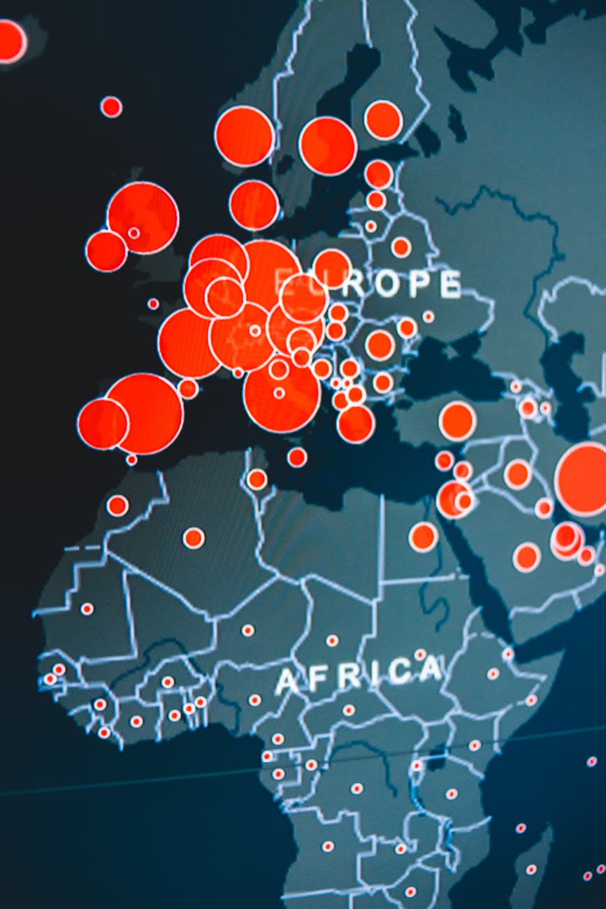
While both thematic and reference maps serve as valuable tools in cartography, they serve different purposes.
Reference maps display a variety of geographic features, such as roads, cities, and natural landscapes, making them useful for navigation and general geographic knowledge.
In contrast, thematic maps focus on a single theme or subject matter, using geographic boundaries as a backdrop to highlight specific data, such as economic indicators or environmental conditions.
The differences can be summarized as follows:
| Reference map | Thematic map | |
| Purpose | Reference maps aim to show the location of geographical features | thematic maps focus on displaying specific data or themes |
| Content | Reference maps include a wide variety of features | thematic maps simplify these features to emphasize theme-related data |
| Use | Reference maps are primarily used for navigation and general geographic knowledge | while thematic maps are used for analysis, decision-making, and understanding spatial patterns. |
General vs Thematic Maps
Based on the data and information they represent, maps can be classified into two categories: general-purpose maps and thematic maps.
For example, general-purpose maps can include reference maps or base maps, showing all surface features accurately and used as a basis for activities related to geographically referenced data (e.g., creating thematic maps).
Benefits of Thematic Maps
Thematic maps represent one of the most effective methods of data visualization.
These maps communicate specific information visually, allowing the viewer to understand the spatial distribution, patterns, and trends of the depicted features or phenomena. Thematic maps have several specific uses, including:
- Simplifying Complex Data: Thematic maps transform data into visualizations that are easy to understand.
- Showing Spatial Patterns: They depict spatial distributions, patterns, and trends of phenomena in an easily interpretable manner.
- Targeting Specific Audiences: Thematic maps meet the needs of specific users, making them accessible even to non-experts.
Characteristics of Thematic Maps
A defining characteristic of a thematic map is its focus on a particular theme or topic as the primary information to be communicated. Often, features like roads, rivers, and contours take a back seat or may not be shown at all.
Thematic maps usually consist of several layers:
Base Map Layer
This is typically derived from a topographic or surface map, providing foundational information such as coordinates, administrative boundaries, or essential features like roads and rivers, if necessary.
Thematic Information Layer
This is the core information that the map aims to convey, such as annual rainfall in a rainfall map or land use information in a land use map.
Supporting Information Layer
This layer includes additional details that help the reader understand the thematic information. For instance, on a tourism map, details like hotel locations or ATMs can be very helpful.
In some cases, supporting information layers can enhance understanding, while in others, they may distract from the primary theme. Therefore, careful selection and symbolization of supporting information are crucial.
The characteristics of thematic maps can be summarized as follows:
Focused Theme
Thematic maps depict a single theme or topic as the central focus.
Minimal Basic Information
They generally include only the necessary base information, often limited to region names and administrative boundaries.
Generalization and Classification
Information on thematic maps is often generalized or classified to clearly convey the intended message. The same data can be displayed differently depending on the map’s purpose.
Types of Thematic Maps
Thematic maps are essential tools for understanding spatial distributions, patterns, and trends. When creating a thematic map, the choice of type should support the map’s intended purpose. Each type of thematic map has specific strengths depending on the nature of the data and the message you want to convey.
Here are several types of thematic maps:
Choropleth Map
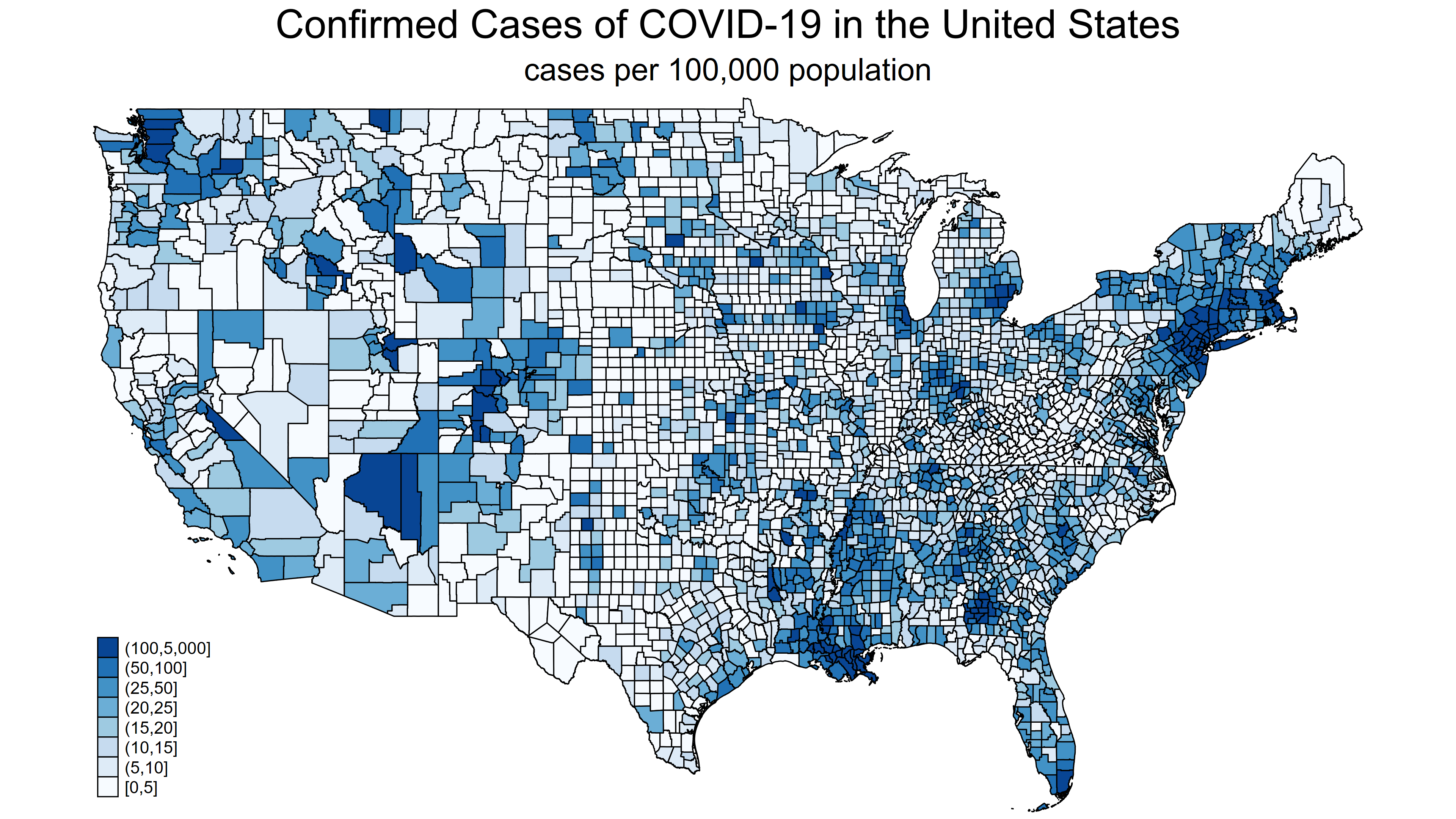
This is one of the most widely used thematic maps.
Choropleth maps show the value of a particular variable across various areas based on specific units, such as administrative regions like villages, districts, counties, or provinces.
However, the unit can also be specific to the map’s theme, such as land cover/use or soil types.
Point Distribution Map (Dot Map)
This type of map shows the distribution of a phenomenon using dots.
Each dot represents a location where the phenomenon occurs. Visual variables used in this map include color and shape.
Dots can represent single or categorical information, such as the distribution of libraries in a city.

Proportional Symbol Map
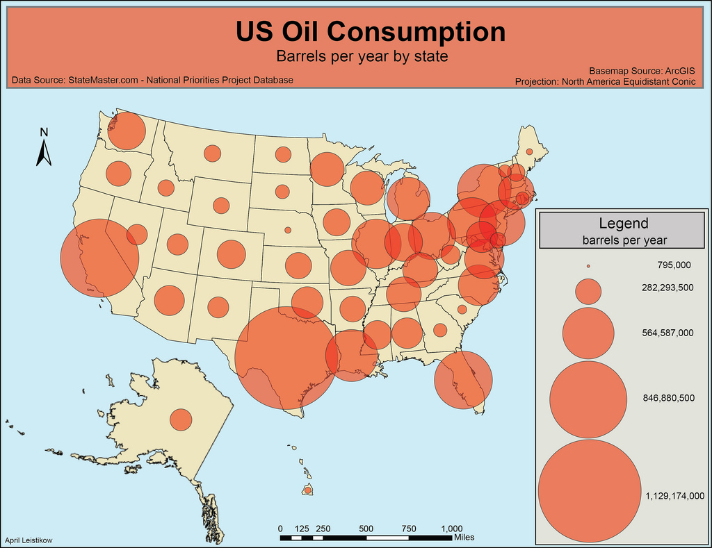
Proportional symbol maps are used to display information where the size of the symbols is proportional to the data being represented.
These maps can be used for both point and area data, such as showing the frequency of floods in various districts.
The location of the symbol may not represent the exact location of the event but rather a conceptual center, like the middle of a district.
Isoline (Isarithmic) Map
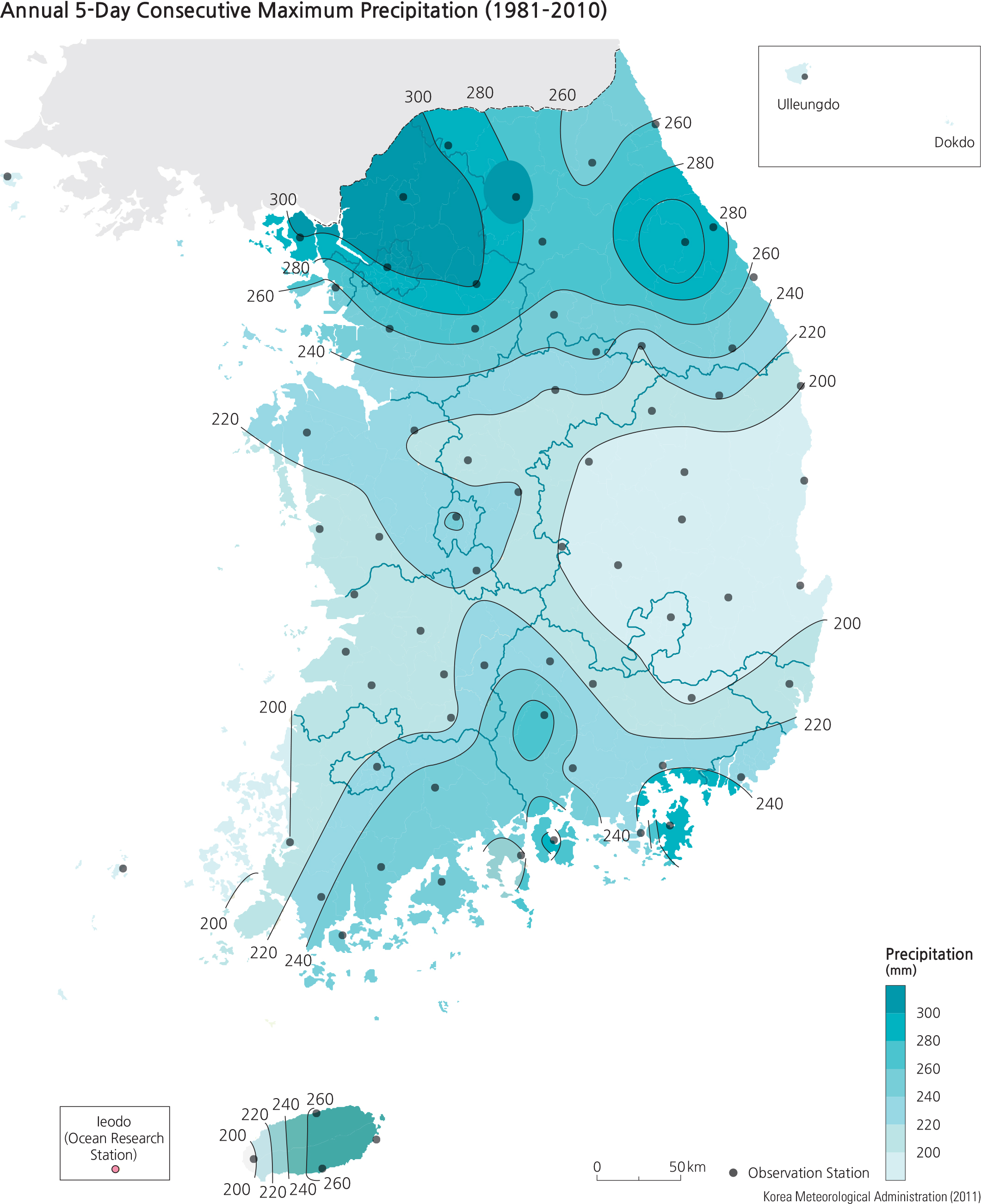
This map type displays lines that connect points of equal value, such as elevation or rainfall.
The most common example is a contour map showing elevation, but it can also be used to represent other continuous data like temperature or pollution levels.
Flow Map
Flow maps use lines to represent the movement of phenomena from one location to another.
The width or thickness of the lines usually varies to show the magnitude of the flow.
Nominal data can be represented using variations in color and pattern, such as dashed or solid lines.
Dasymetric Map
Similar to a choropleth map, a dasymetric map uses area symbols to classify data spatially.
However, it places data more accurately within its actual location, such as population data being represented only in populated areas, not uniformly across the entire region.
This method helps improve the map’s accuracy and focus.

Just look at the differences of the same population data when displayed using a chloropleth (left) vs a dasymetric (right) below.

Prism Map
Prism maps use visual perspective height to represent data, making them a 2.5D or 3D type of thematic map.
For example, the map might represent the population density as the height of each region, creating a three-dimensional effect.
Bivariate or Multivariate Map
These maps display two or more variables on the same map by using different colors, symbols, or patterns.
For instance, a bivariate map might show both population density and income levels, allowing for the analysis of relationships between the two variables.
Multivariate maps are more complex but provide a richer understanding of spatial relationships.
Heat Map
Heat maps use color gradations to represent data density or intensity within an area.
Often used in analyzing phenomena like traffic congestion or website user behavior, heat maps make it easy to identify hotspots where data values are particularly high or low.
Cartogram
Cartograms distort geographic boundaries to represent data variables like population size or economic output.
The size of each area is proportional to the variable being mapped rather than the actual land area.
For example, a population cartogram might show densely populated areas much larger than they are geographically, while sparsely populated areas shrink.
Dot Density Map
Similar to point distribution maps, dot density maps use dots to represent frequency.
However, unlike point distribution maps, the dots in a dot density map are often randomly placed within geographic boundaries and represent a fixed quantity of occurrences.
This type of map is effective for showing density patterns across large areas.
Grid Map
Grid maps divide the map into equal-sized cells, where each cell is color-coded based on the data value it contains.
This type of map is particularly useful for simplifying complex spatial data into a more digestible form, especially when dealing with large datasets.
Time-Series Map
Time-series maps show changes in data over time, often through a sequence of maps.
This approach is particularly useful for tracking trends, such as the spread of a disease or changes in land use patterns.
Animated time-series maps are especially effective in showing dynamic changes.
Climograph Map
A climograph map is a combination of a bar and line graph overlaid on a map, representing climate data such as temperature and precipitation over time for specific locations.
This type of map is useful in environmental studies and climatology.
Infographic Map
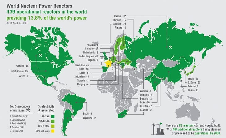
Infographic maps are a type of thematic map that combines data representation with visually engaging graphics to simplify complex information.
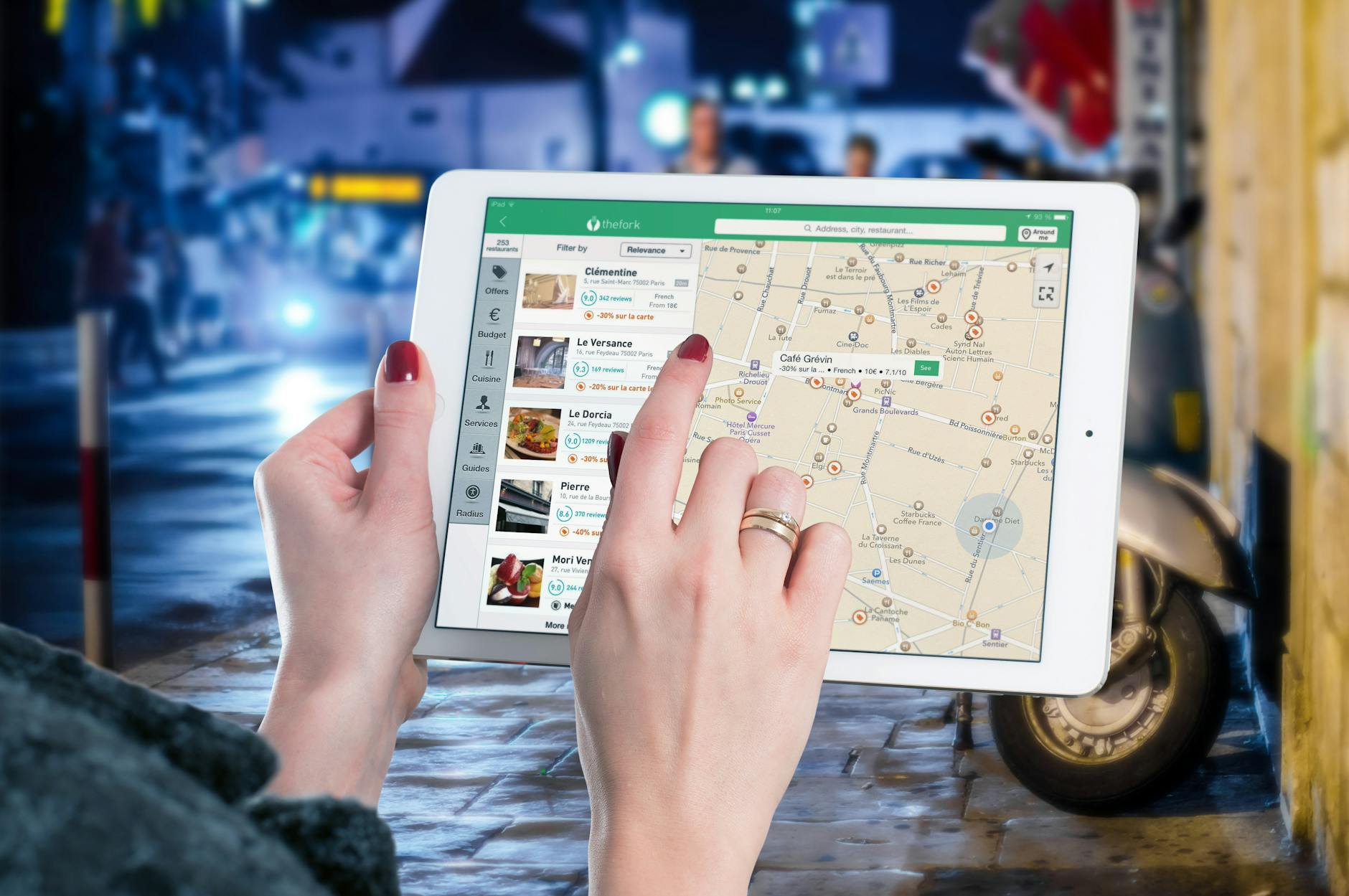
Interactive Map
Interactive maps, for example, allow users to engage with data in a dynamic way, offering an enhanced understanding of spatial relationships.
Case Study: Use of Thematic Maps in Various Real-World Projects
Thematic maps are utilized in a wide range of real-world applications. Here are some examples:
- Customer Satisfaction Scores Visualization: Choropleth maps visualize customer satisfaction scores across different regions. This enables businesses to quickly identify high and low-performing areas, allowing them to target improvements where they are most needed.
- Endangered Species Distribution: Dot distribution maps are essential for showing the locations of endangered species within a national park. This visual representation guides conservation efforts by highlighting critical habitats.
- Earthquake Magnitudes Representation: Proportional symbol maps illustrate varying earthquake magnitudes across a region. Larger symbols indicate more severe earthquakes, making it easy to assess which areas are most at risk.
- Noise Pollution Mapping: Isoline maps visualize noise pollution across urban areas, showing how different regions are affected by soundscapes. This information is crucial for urban planning and improving quality of life.
- Aging Population Analysis: A project utilizes choropleth maps to analyze and visualize the aging population across counties. This information helps policymakers plan for future healthcare and social service needs.
- Sea Level Rise Predictions: Isoline maps are employed to predict and visualize the impacts of sea-level rise along coastlines. These maps emphasize the potential consequences of climate change and inform mitigation strategies.
- Public Amenities Distribution: Dot distribution maps show the locations of public amenities like parks, libraries, and community centers across cities. These maps aid urban planners in identifying underserved areas and guiding future developments.
- Ancient Civilizations Visualization: Proportional symbol maps illustrate the relative sizes of ancient civilizations at their peak. This type of thematic map is particularly useful in educational materials, bringing historical data to life.
- Urban Heat Island Effect Visualization: Isoline maps were used to show temperature variations across a city. These maps helped urban planners make informed decisions about where to plant more trees, install green roofs, and use heat-reflective materials.
- COVID-19 Vaccination Campaign: Choropleth and proportional symbol maps tracked vaccination rates and vaccine distribution centers across a state. These maps were essential in adjusting strategies and increasing public engagement.
- Childhood Obesity Tracking: Choropleth maps visualized childhood obesity rates across different school districts. The insights gained from these maps guided health interventions and policy changes to address the issue effectively.
Creating Effective Thematic Maps
Now that we’ve explored the what and why of thematic maps, let’s dive into the how. Creating an effective thematic map is both an art and a science.
Here’s a step-by-step guide to help you create a thematic map:
Define Your Purpose
Establish the objective of your map.
Ask yourself : What story are you trying to tell? What question are you trying to answer? Your purpose guides all your subsequent decisions.
Gather Data
Make sure you collect accurate and relevant data that aligns with your theme.
In my experience, using outdated data can lead to significant inaccuracies.
I once used outdated census data for a project, which led to major issues. The lesson? Always double-check your data sources.
Choose the Right Type of Map
Select the appropriate type of thematic map based on the data you have and the message you want to communicate.
Each type has its own strengths, so choose wisely based on your data and objective.
Design Your Map
Focus on map design elements such as color schemes, symbols, and legends to ensure clarity and effectiveness.
Always prioritize the map’s readability and accuracy, though aesthetics are important too.
Review and Revise
Show your map to others and gather feedback.
Ask yourself: Does it convey the information clearly? Is anything confusing?
Be prepared to make adjustments to improve its effectiveness.
Challenges and Considerations
While thematic maps provide incredible value, there are several challenges and considerations to keep in mind:
Danger of Misrepresentation
It’s surprisingly easy to create a map that, while technically accurate, gives a misleading impression. For example, a choropleth map showing income levels by county might make rural areas look more significant than they are if the map doesn’t account for population density.
Importance of Context
Maps don’t exist in a vacuum. Without proper context, even the best-designed map can be misinterpreted. A case in point: a crime rate map might be used to label certain neighborhoods as dangerous without considering factors like population density or types of crimes. Always provide relevant context to guide interpretation.
Ethical Considerations
In my experience, when mapping sensitive data, such as race, income, or health statistics, it’s essential to consider the ethical implications. Consulting with community representatives or experts can help ensure that your map is respectful and constructive.
Technical Challenges
Creating effective thematic maps often involves dealing with complex data and sophisticated software. Some common technical challenges include data cleaning, choosing appropriate geographic units, and ensuring accessibility across devices and for users with disabilities.
Final Reflection on Thematic Maps
Thematic maps are more than just tools for visualizing data; they are powerful instruments for analyzing and understanding complex information.
As I’ve learned, by revealing patterns, trends, and relationships that might not be immediately apparent, thematic maps play a crucial role in shaping our understanding of the world and influencing decision-making.
As we continue to advance in mapping technology, the importance of thematic maps will only grow. Whether used in urban planning, public health, education, or environmental management, thematic maps provide valuable insights that can drive positive change.
If you have any questions or would like to discuss further, please feel free to leave a comment below.
And as always, happy mapping folks!